It’s not what you say,
it’s what you do.

Projects
Projects
Logofolio
Logofolio
Logofolio
Projects
Logofolio
Projects
Projects
Projects
Logofolio
Logofolio
Logofolio
Logofolio
Logofolio
Logofolio
Logofolio
Logofolio
Projects
Logofolio
Logofolio
Logofolio
Logofolio
Projects
Projects
Logofolio
Logofolio
Logofolio
Logofolio

Splash Screen

RadiomedAPP - UX/UI Design

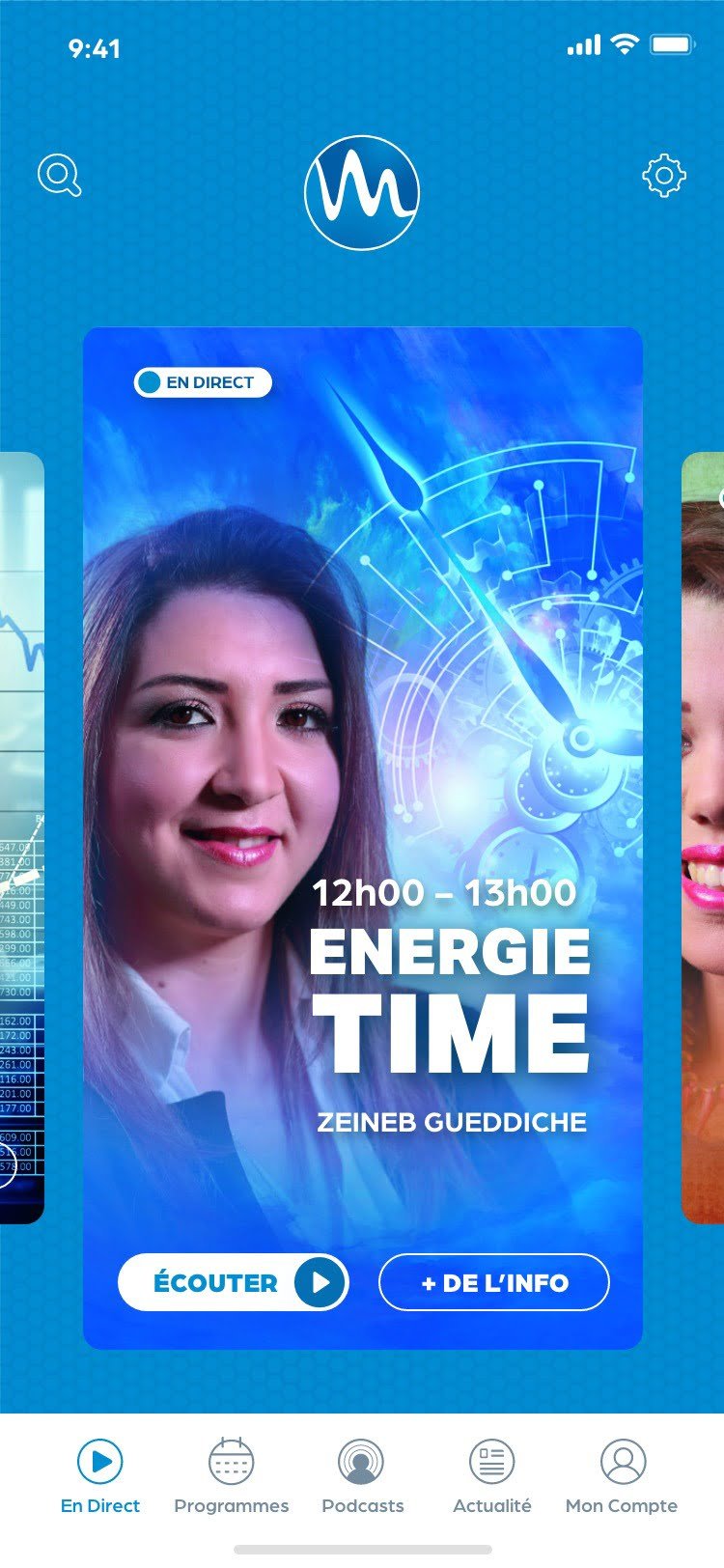
Home Screen

RadiomedAPP - UX/UI Design

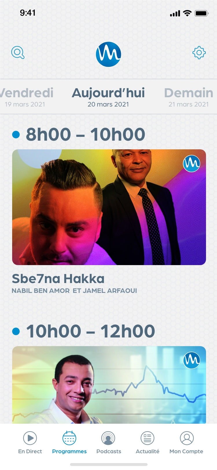
Programs Screen

RadiomedAPP - UX/UI Design

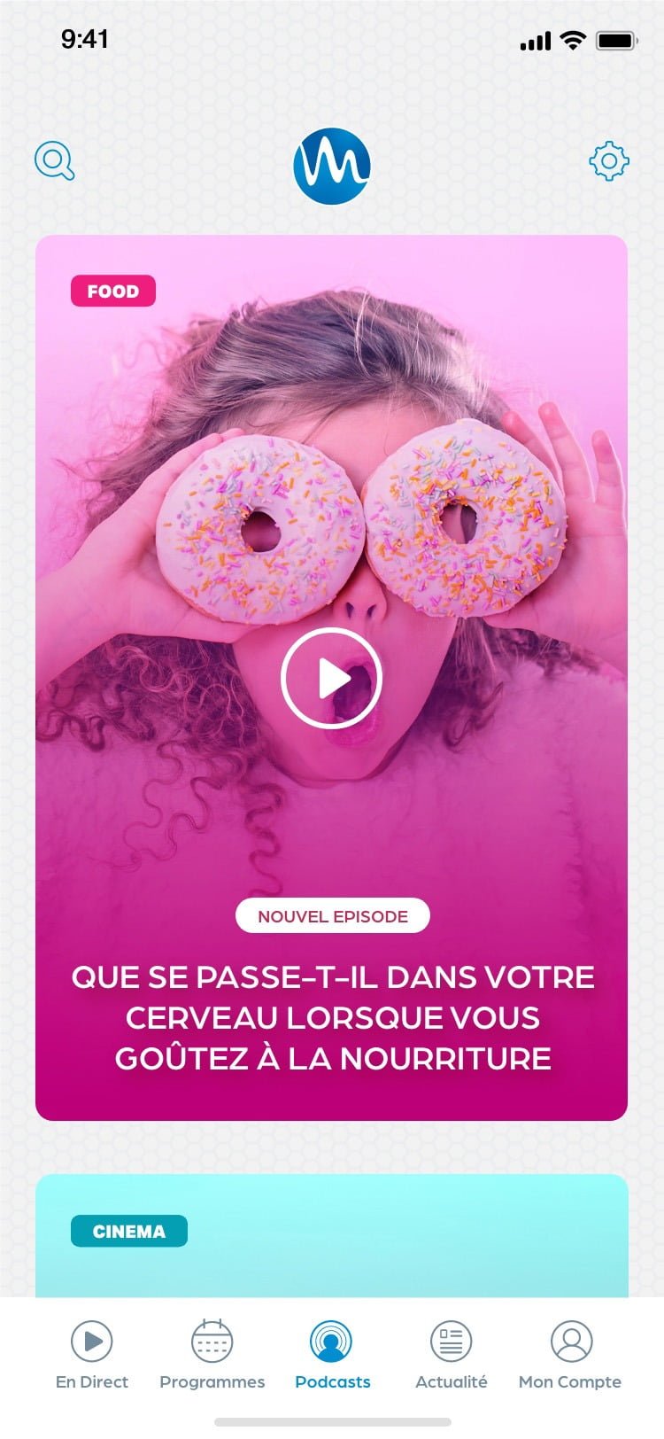
Podcasts Screen

RadiomedAPP - UX/UI Design

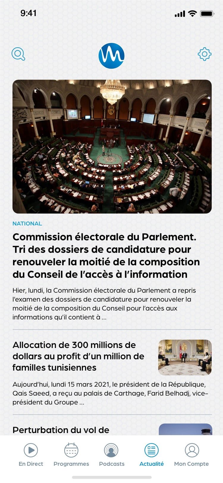
News Screen

RadiomedAPP - UX/UI Design

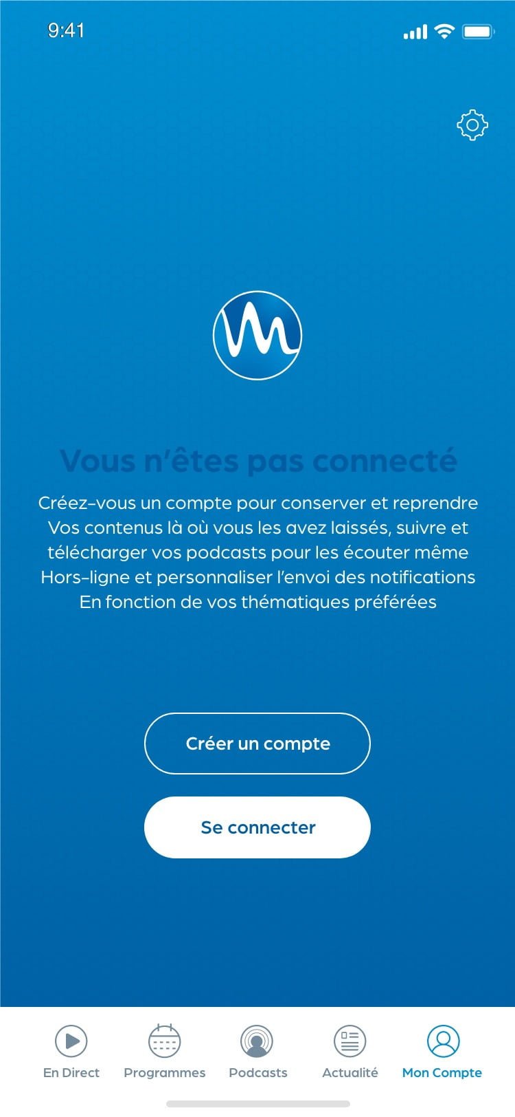
My Account Screen

RadiomedAPP - UX/UI Design

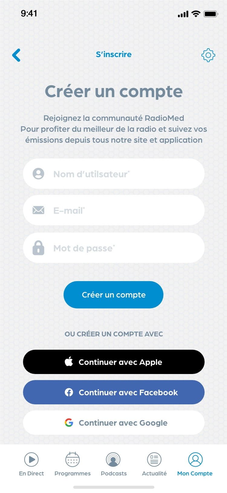
Signup Screen

RadiomedAPP - UX/UI Design

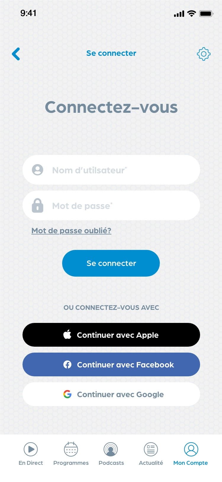
Login Screen

RadiomedAPP - UX/UI Design

Home Page

CJB - UX/UI Design

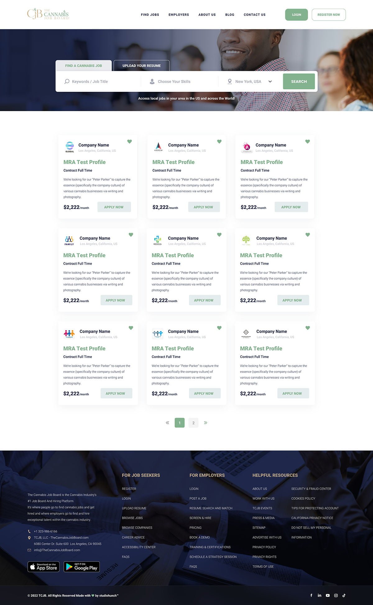
Jobs Page

CJB - UX/UI Design

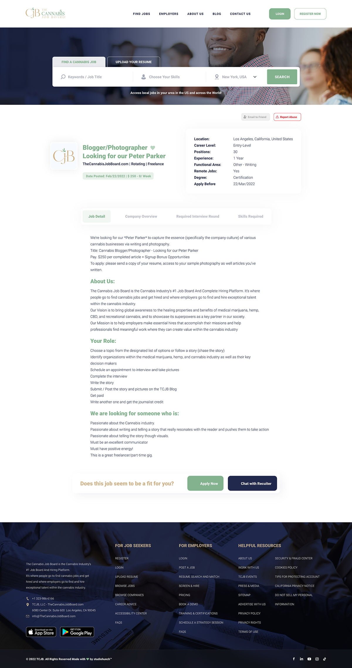
Job Details Page

CJB - UX/UI Design

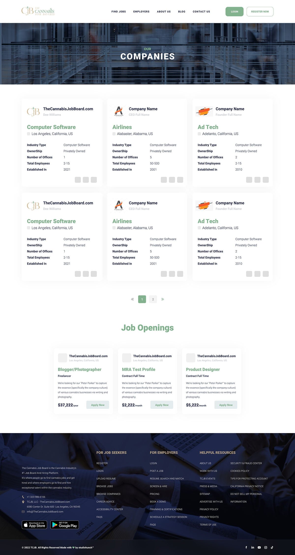
Companies Page

CJB - UX/UI Design

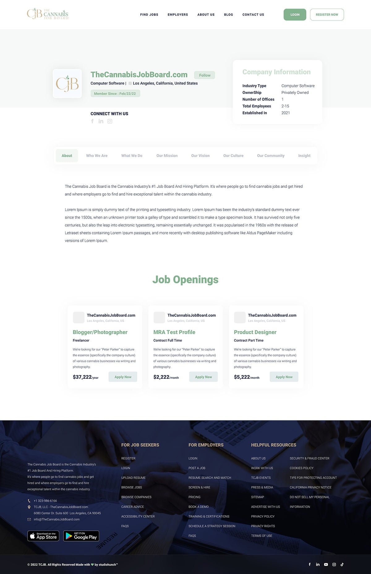
Company Details Page

CJB - UX/UI Design

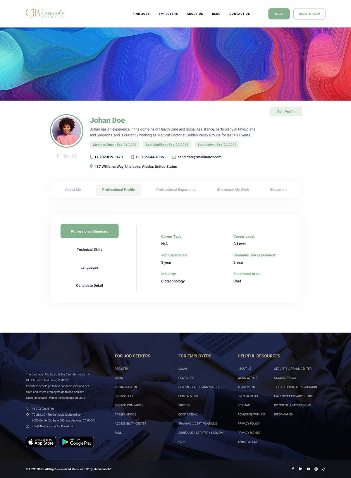
Candidat Profile Page

CJB - UX/UI Design

Blog Page

CJB - UX/UI Design

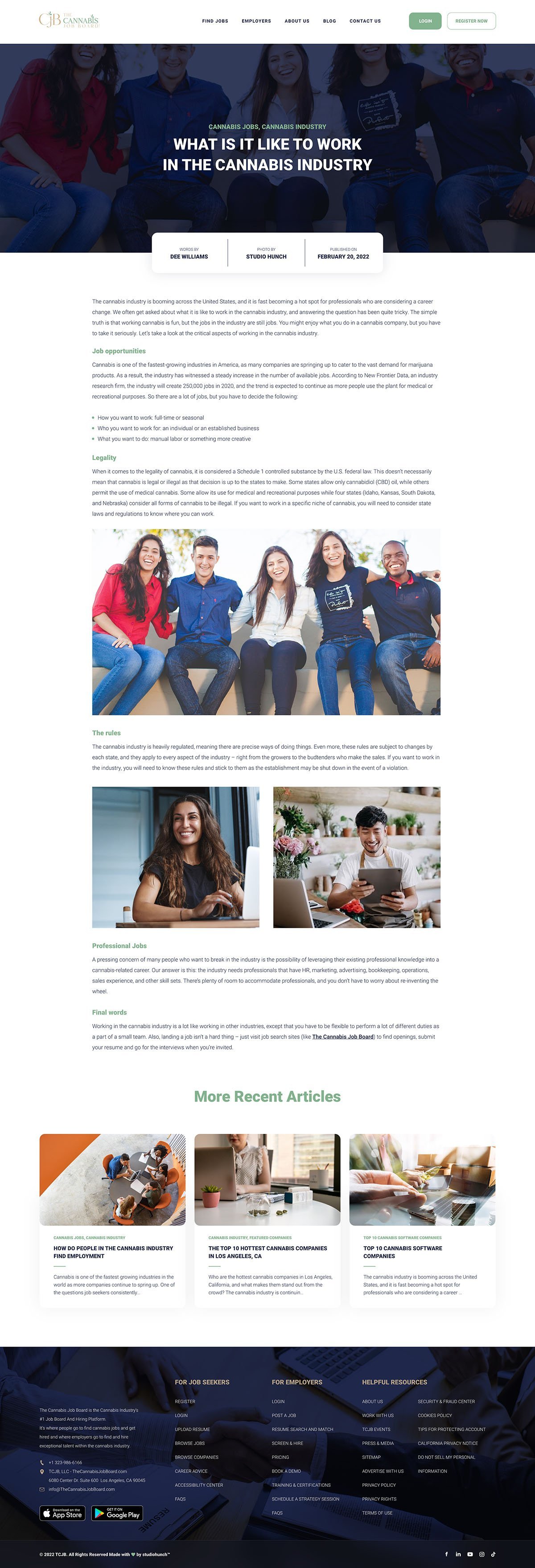
Blog Details Page

CJB - UX/UI Design
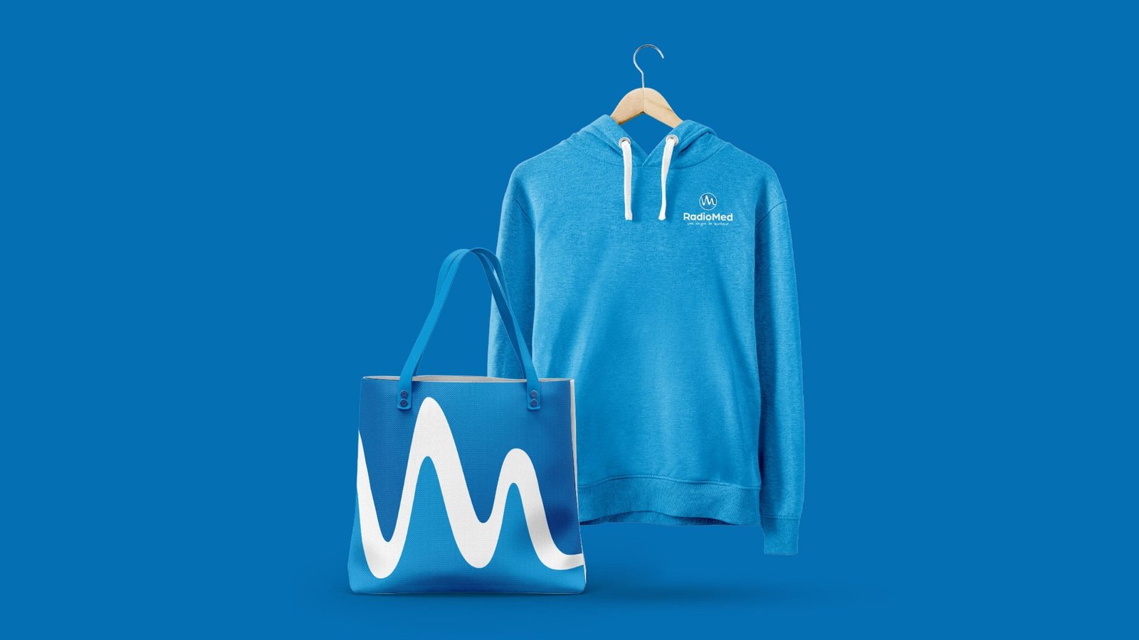
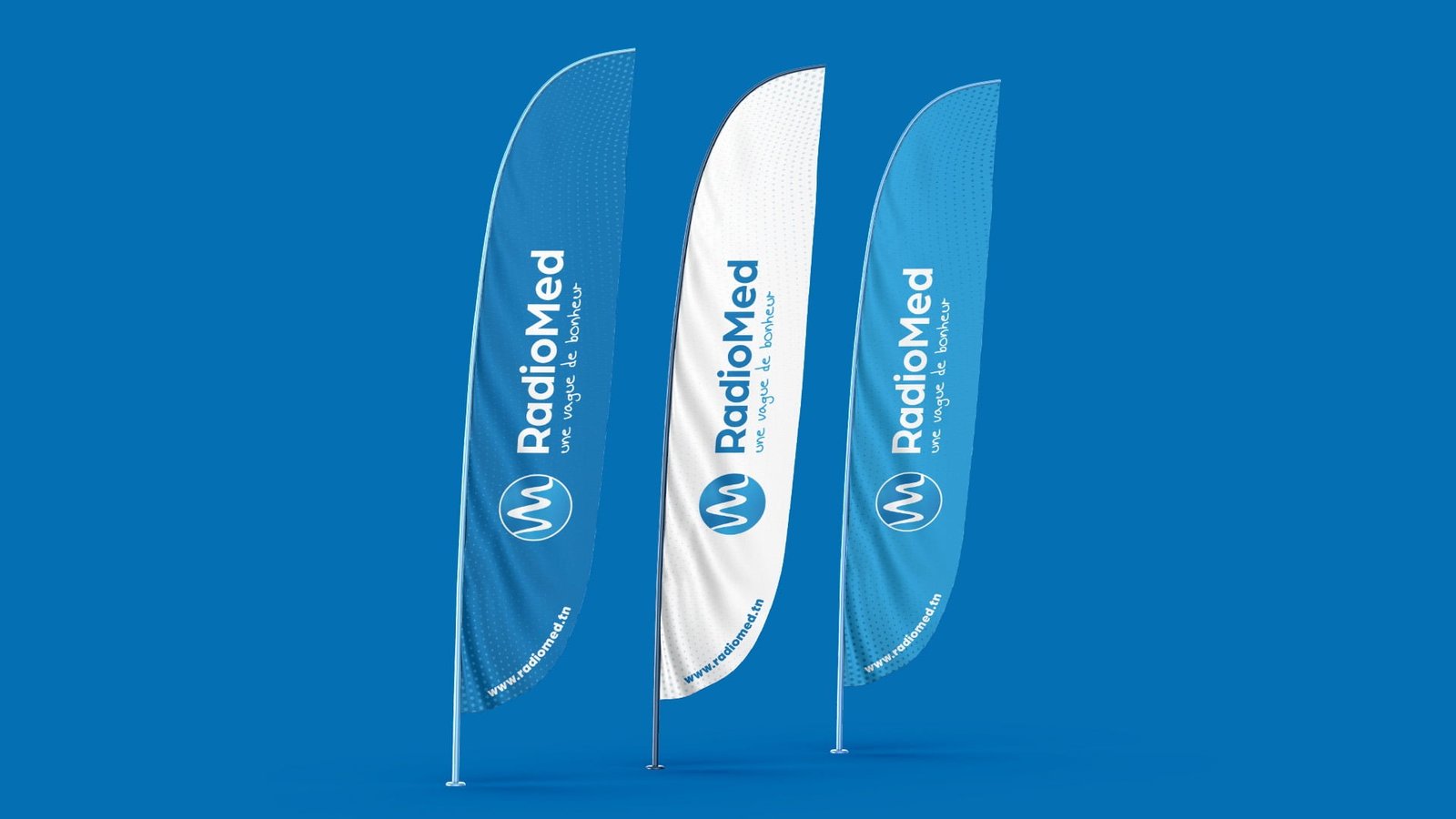
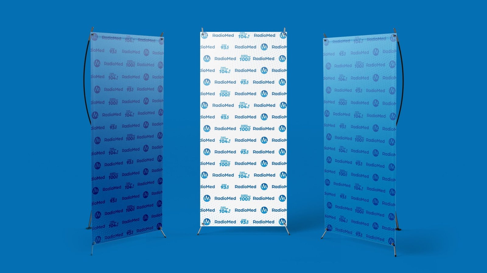
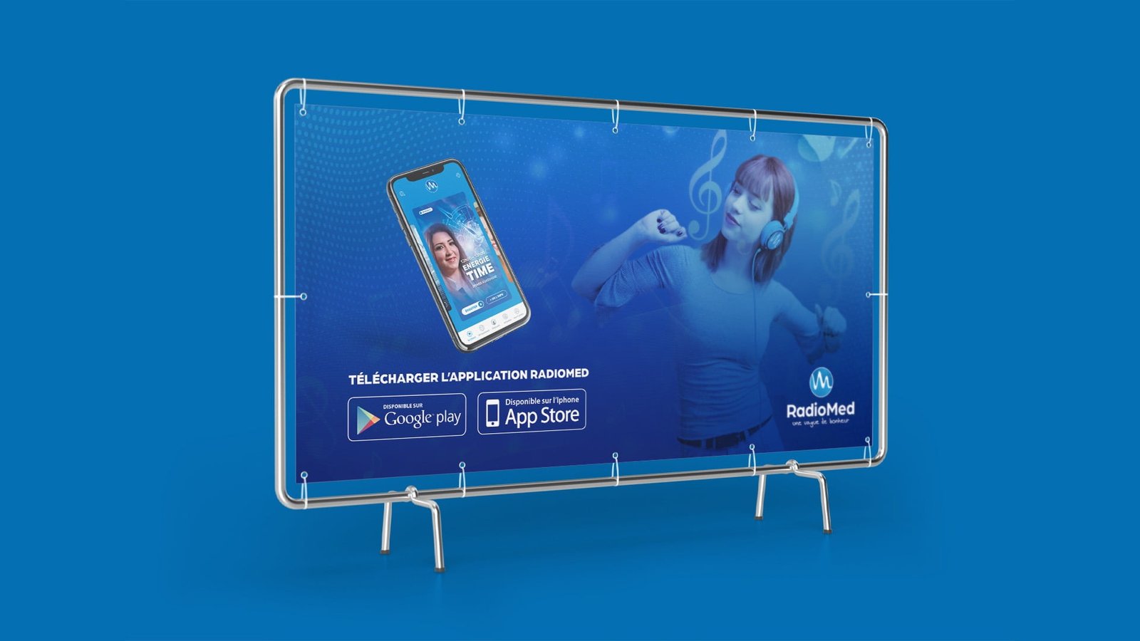
Radiomed Design

Broadcasting
the news and music
for 24 hours a day

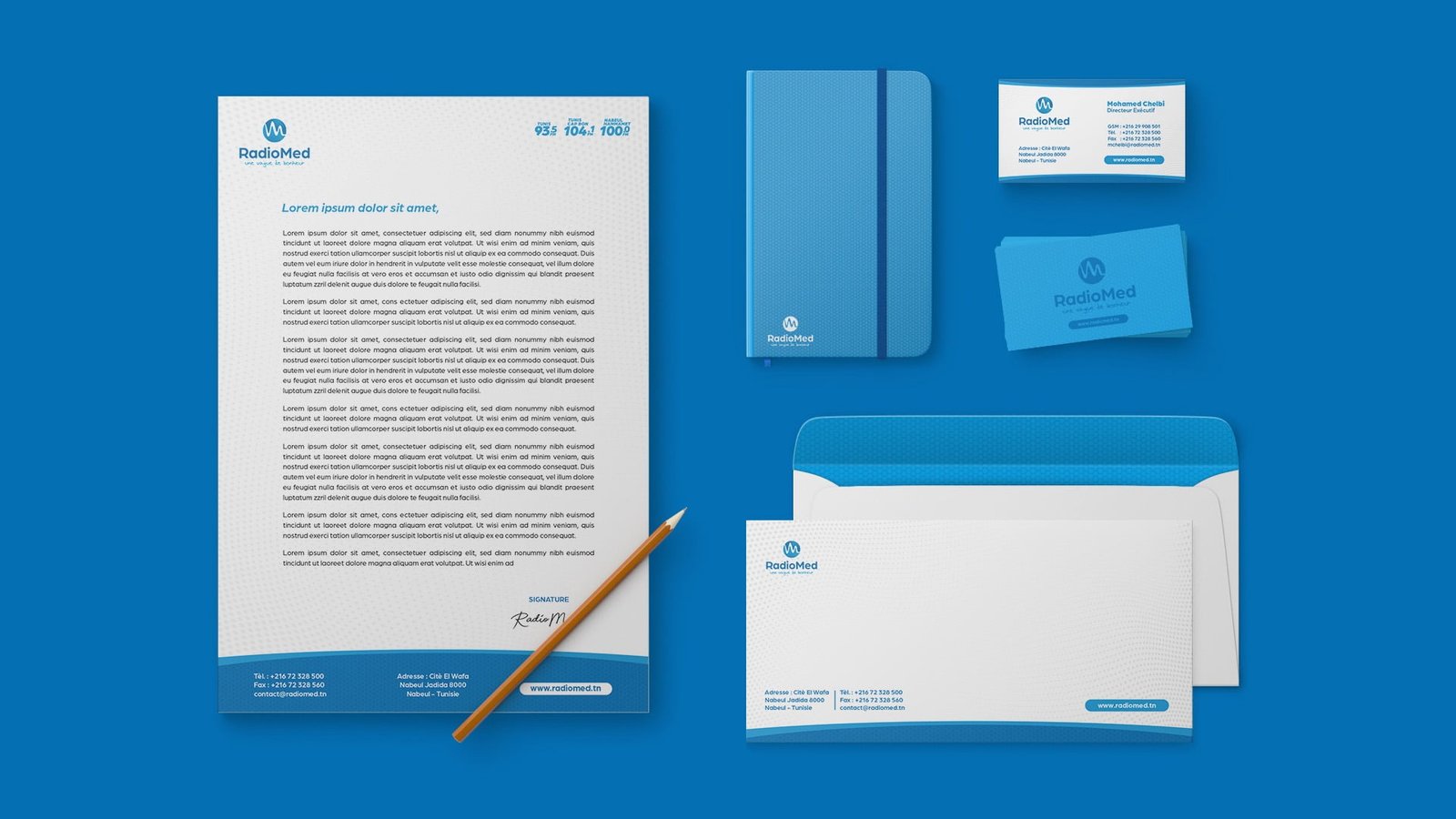
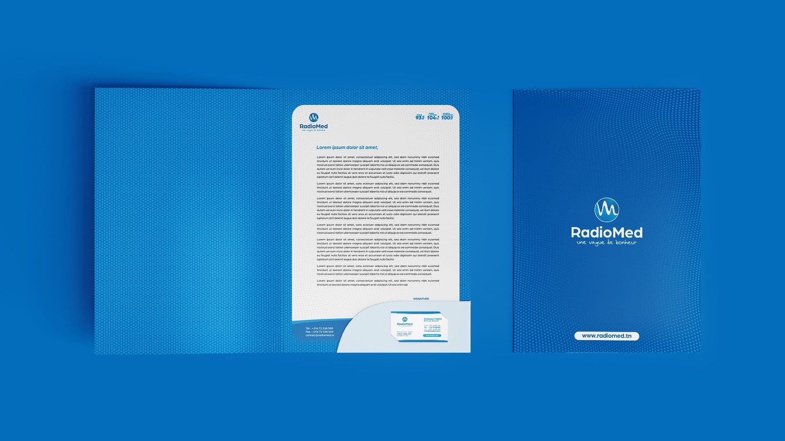
Radio Med is a generalist Tunisian radio station with a regional vocation located in Cap Bon.

Projects

LOGO CONCEPT

Projects

RESPONSIVE LOGO / GRID Sizes and Clear Spaces

Projects
Projects
Projects

MINIMUM SIZES

Minimum size specification ensure that the logo lockup remains legible in all applications.
The logo lockup should never be reproduced smaller than the indicated size :

Projects
Projects

APP ICON

iOS

The icon has been designed according to iOS
app icon guidelines with a few modifications
to achieve optimal readability, yet maitain
consistency with the iOS ecosystem.

Projects
Projects
Projects

Android

The Android icon has been created based on Google Material Design Guidelines.
We chose the circle as the main icon shape
to achieve better shape contrast.

Projects

Use on different Background

Projects
Projects

Brand Colors

Radiomed - Branding

The GRADIENT

Projects
Radiomed - Branding
Radiomed - Branding
Radiomed - Branding
Radiomed - Branding
Radiomed - Branding
Radiomed - Branding
Radiomed - Branding
Radiomed - Branding
Radiomed - Branding

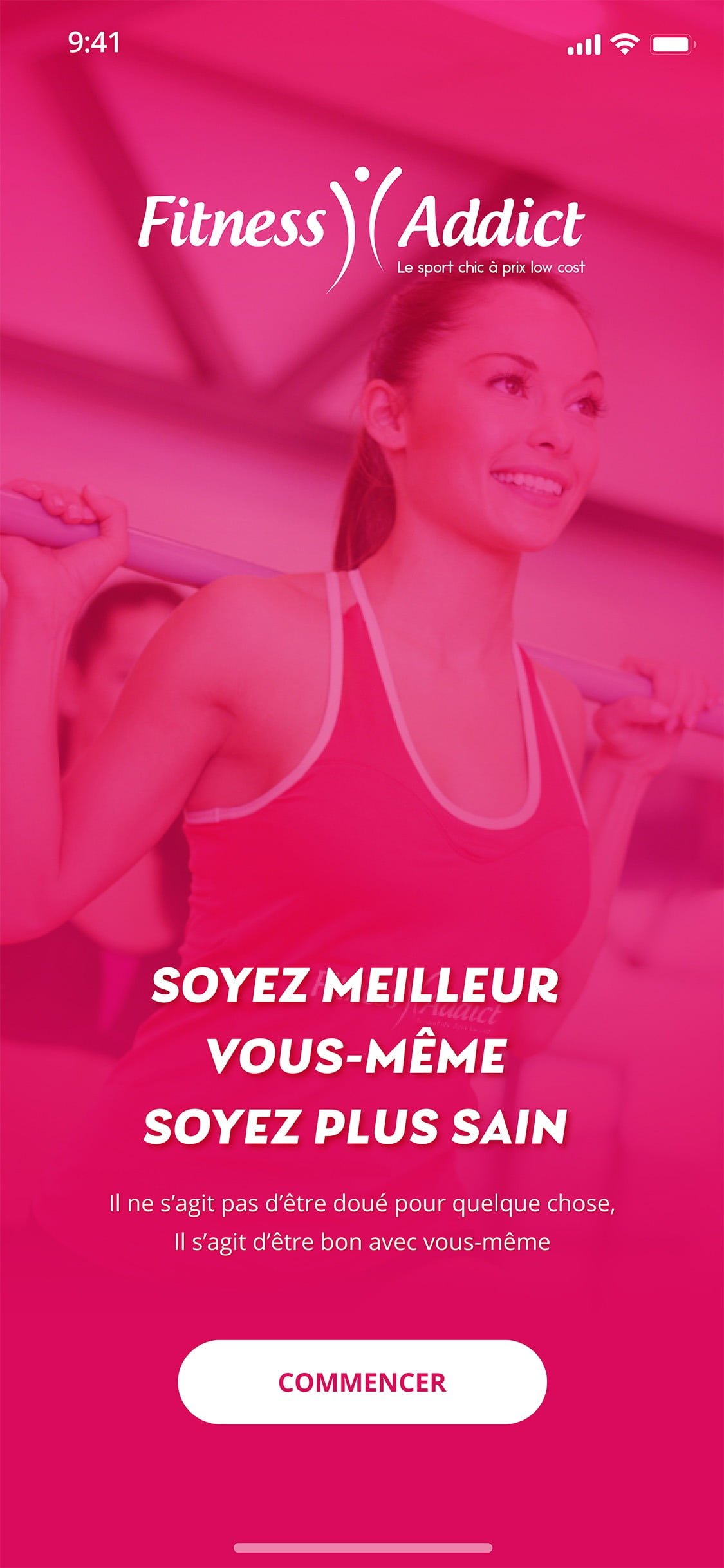
Splash Screen

FitnessAddictAPP - UX/UI Design

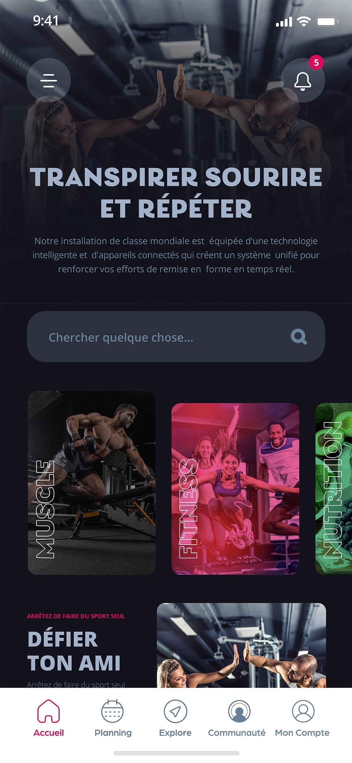
Home Screen

FitnessAddictAPP - UX/UI Design

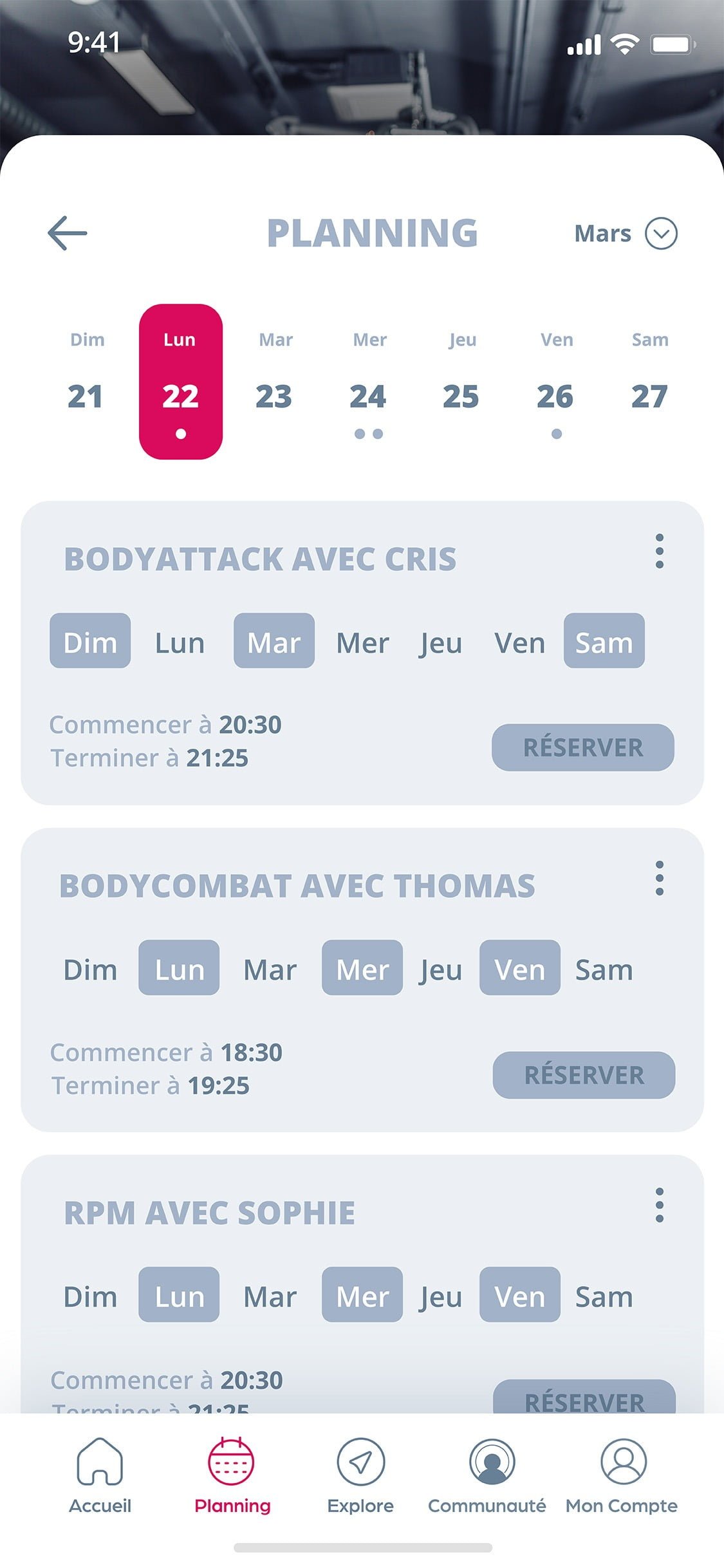
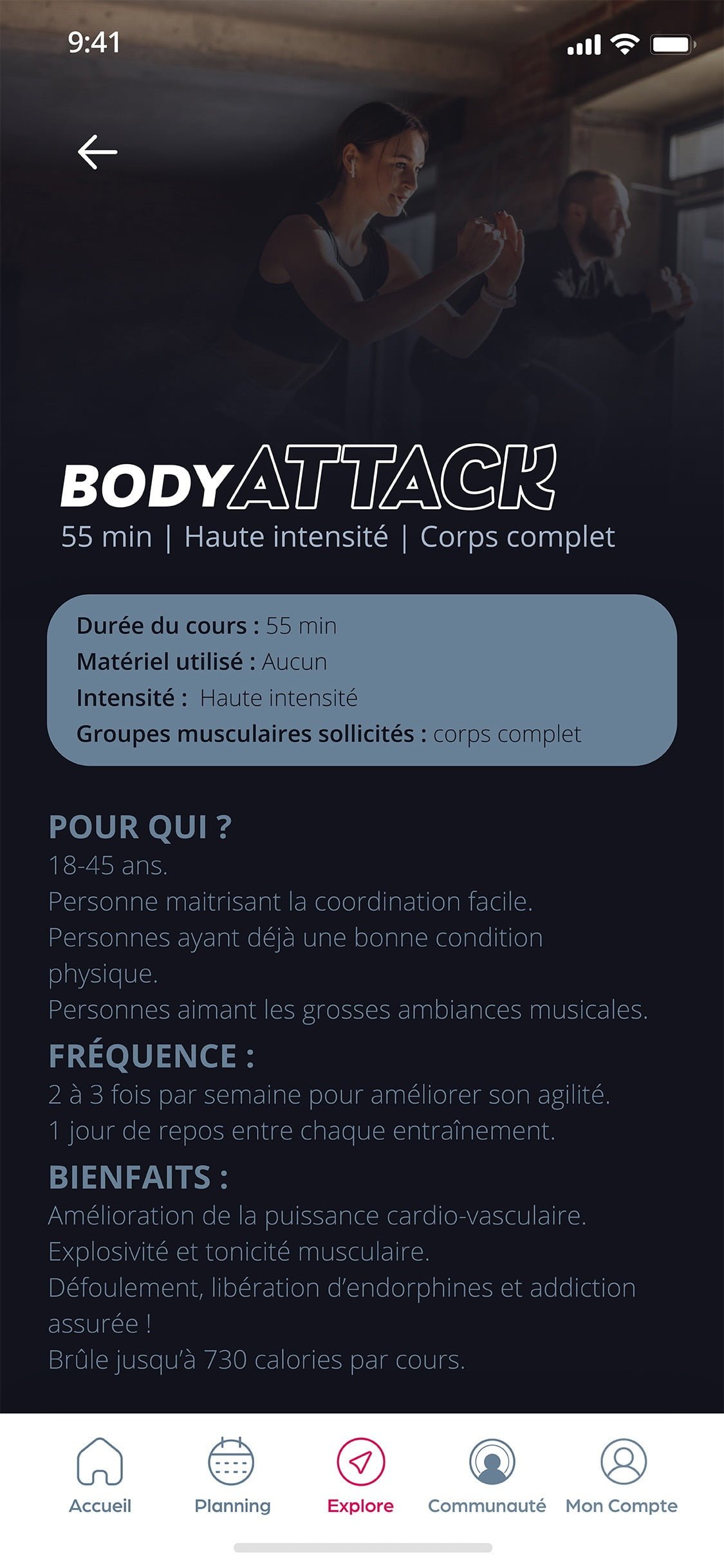
Planning Screen

FitnessAddictAPP - UX/UI Design

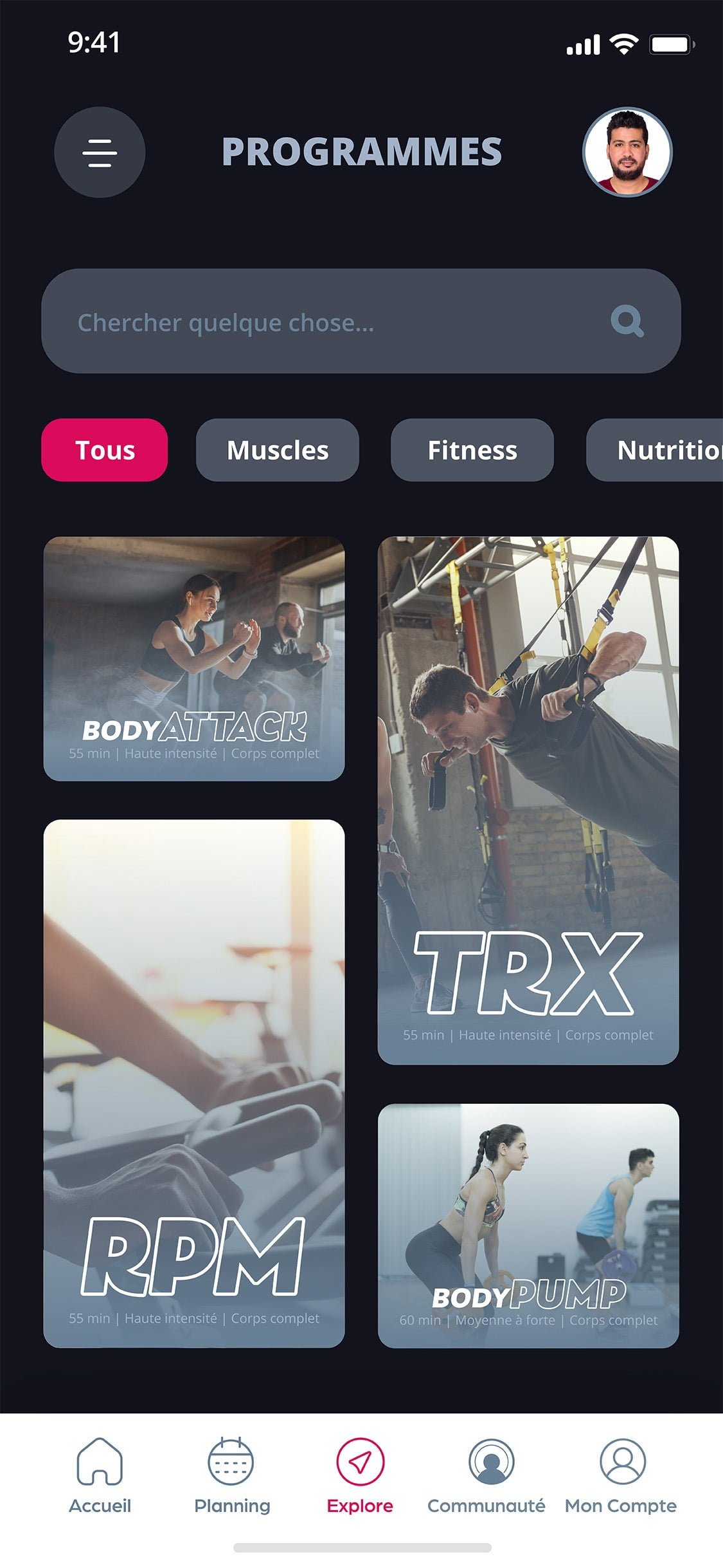
Explore Screen

FitnessAddictAPP - UX/UI Design

Program Details Screen

FitnessAddictAPP - UX/UI Design

Home Page

Kara Lilly - UX/UI Design

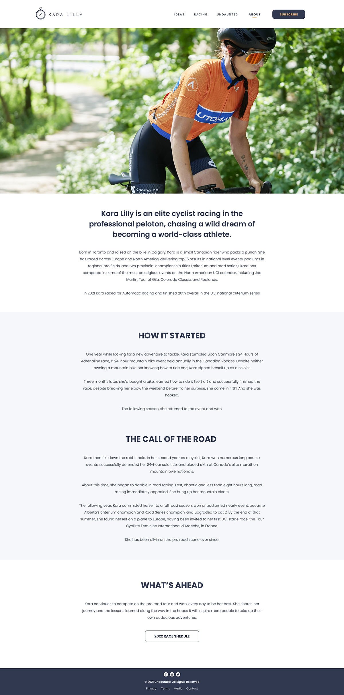
About Page

Kara Lilly - UX/UI Design

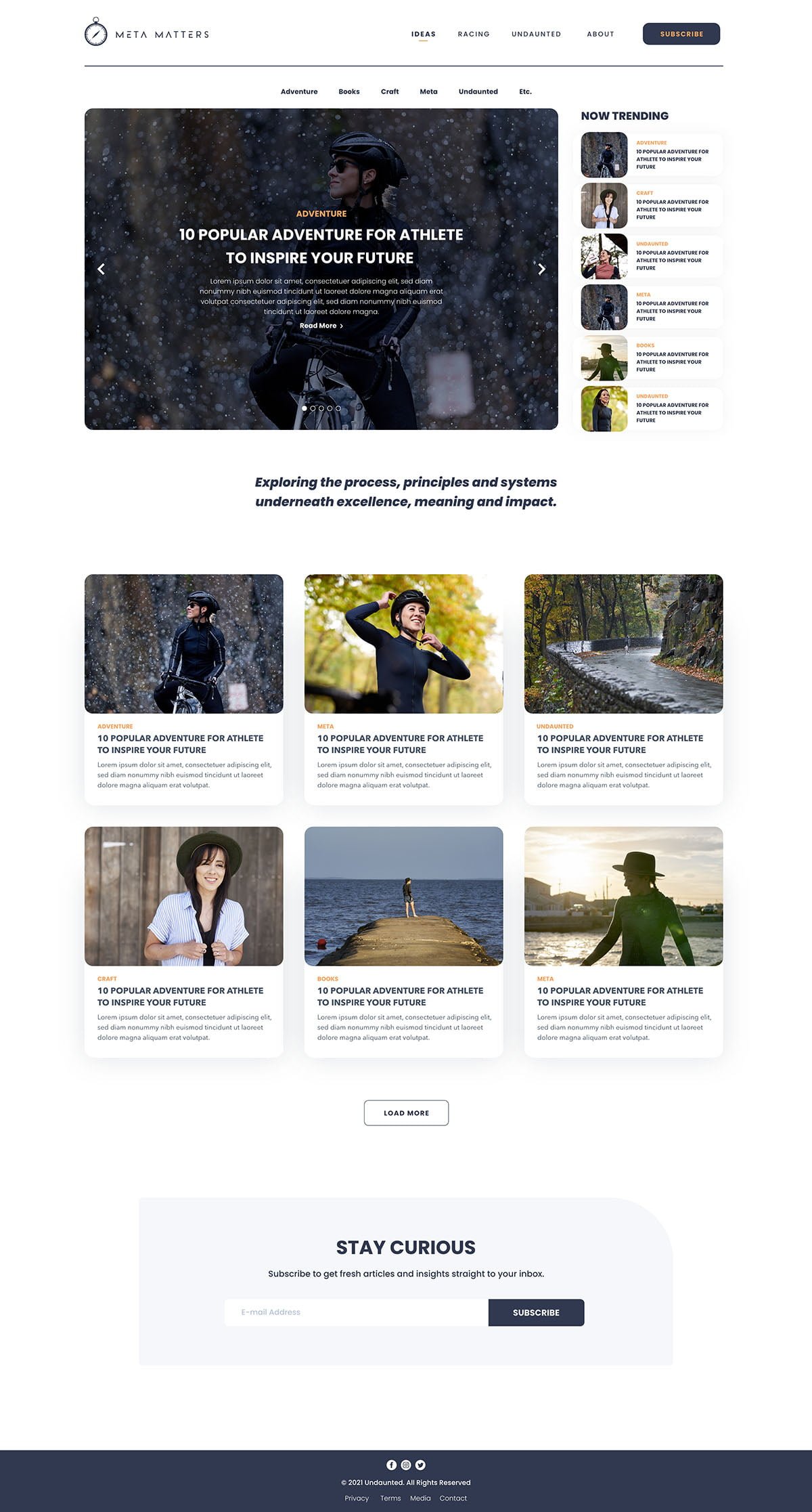
Blog Page

Kara Lilly - UX/UI Design

Blog Individual Page

Kara Lilly - UX/UI Design

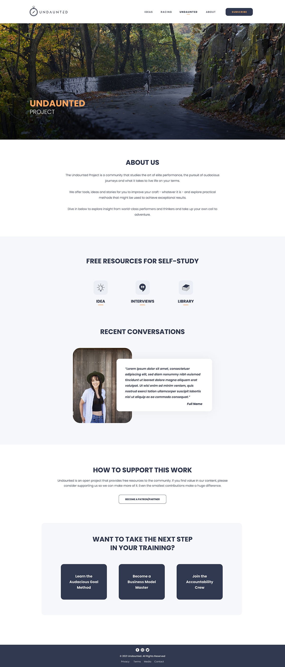
Undauted Page

Kara Lilly - UX/UI Design
Sugar Daddy - UX/UI Design
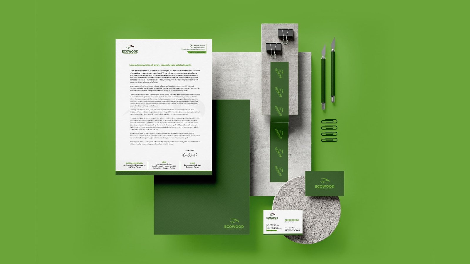
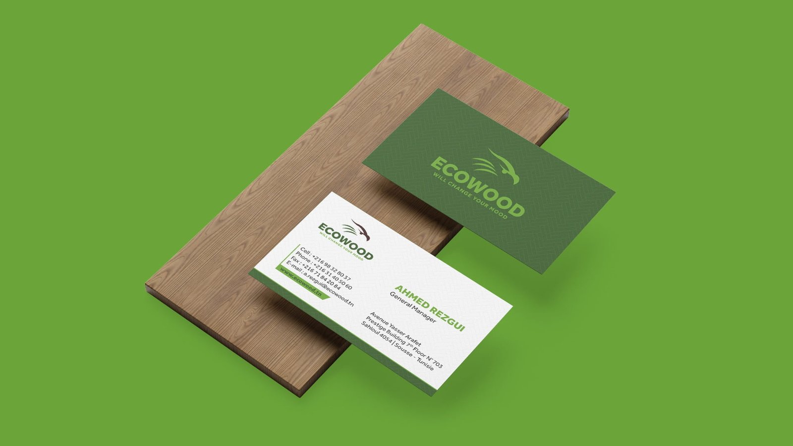
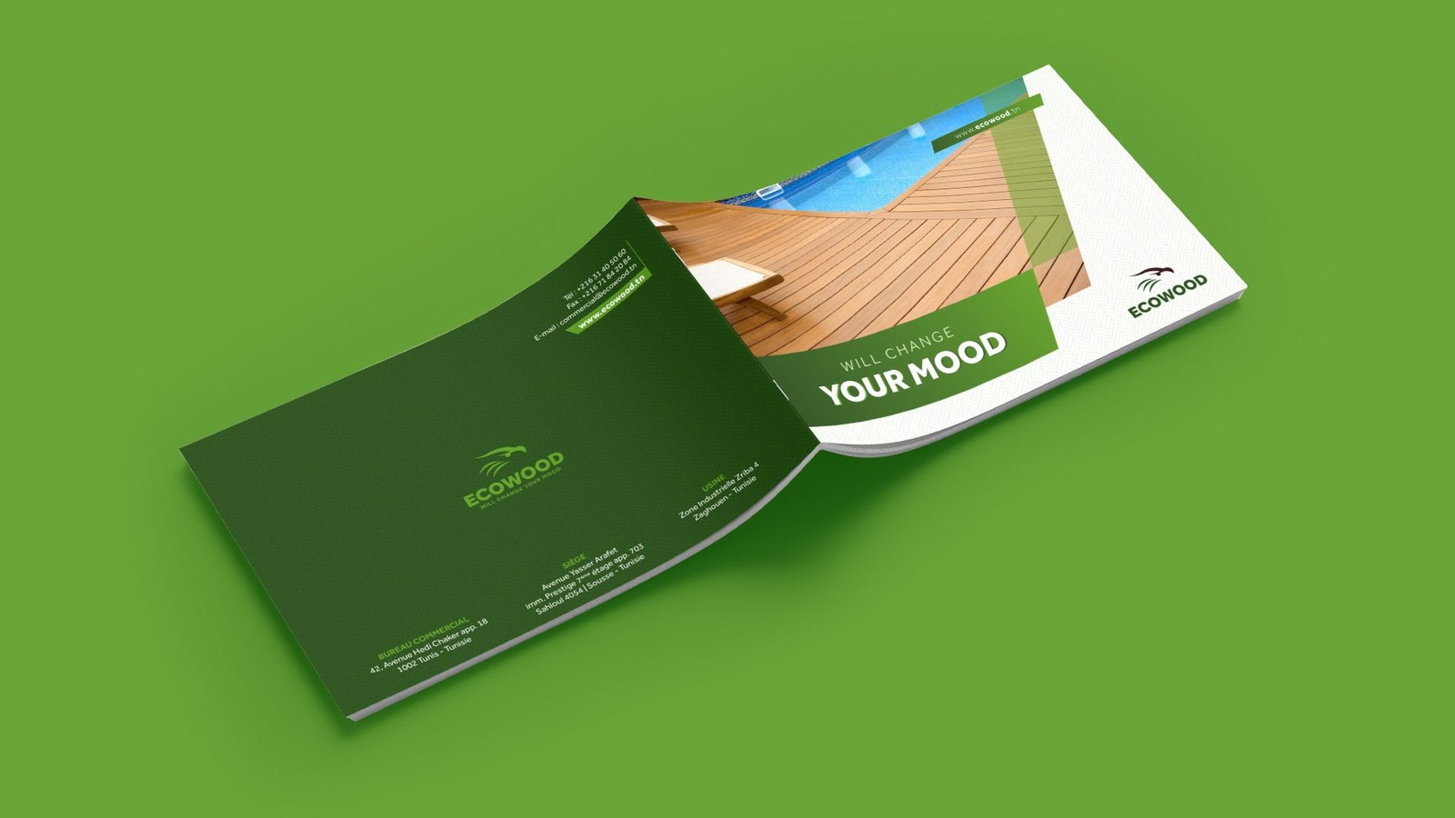
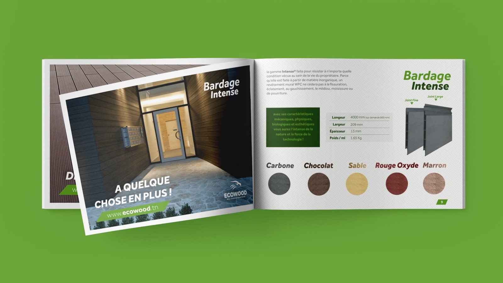
Ecowood Design

Making innovative
wood from nature.

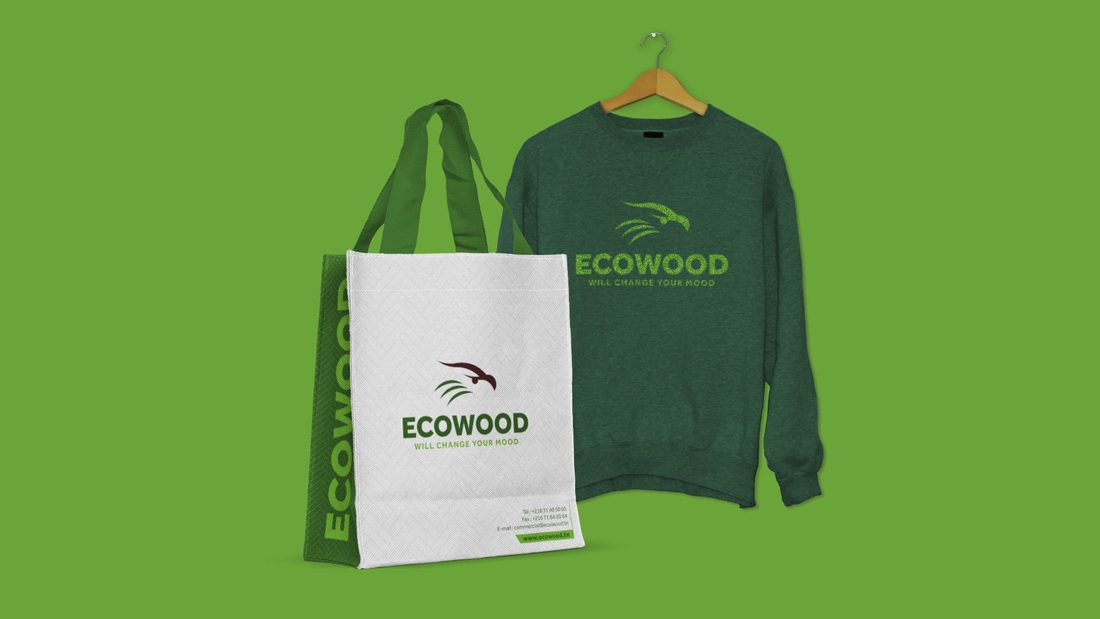
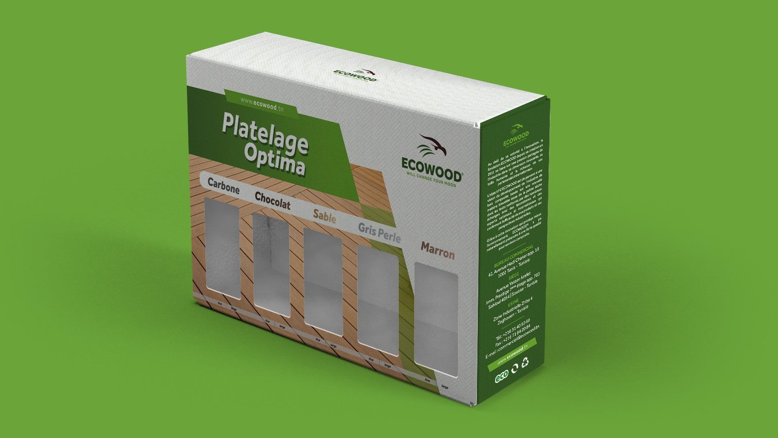
ECOWOOD is the first company to manufacture composite wood in Africa and in the Arab world.
By its mastery of the material, its history and its innovation, Ecowood occupies a leading position in Tunisia and in Africa in the manufacturing of composite wood and benefits from a reference image on its market.

Projects

Logo Construction

Projects
Projects

Whether you believe in the Golden Ratio or not, our experience is that
this technique helps to build balanced, aesthetic shapes.

RESPONSIVE LOGO / GRID Sizes and Clear Spaces

Projects
Projects
Projects

MINIMUM SIZES

Minimum size specification ensure that the logo lockup remains legible in all applications.
The logo lockup should never be reproduced smaller than the indicated size :

Projects
Projects

Use on different Background

Projects
Projects

Brand Colors

Projects

The GRADIENT

Projects
Projects
Projects
Projects
Projects
Projects
Projects
360 Certifications - UX/UI Design
Projects

Delivering the prouve
that you are well insured

The Tunisian Federation of Insurance (FTUSA) is the spokesperson of the insurance and reinsurance companies operating in Tunisia with their various interlocutors.

Projects

PRESENTATION

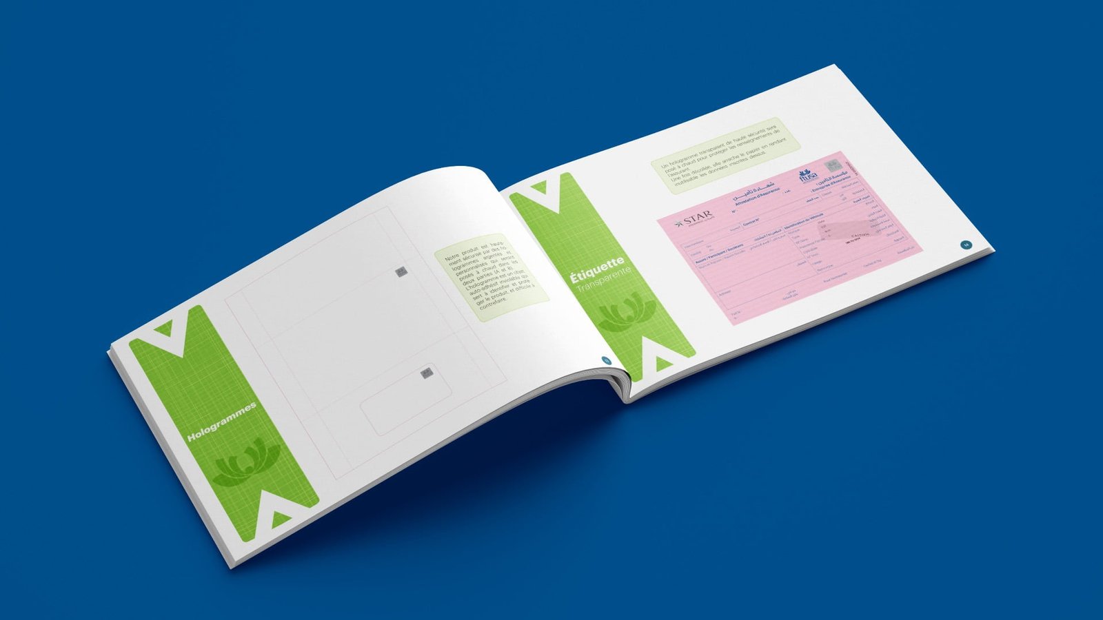
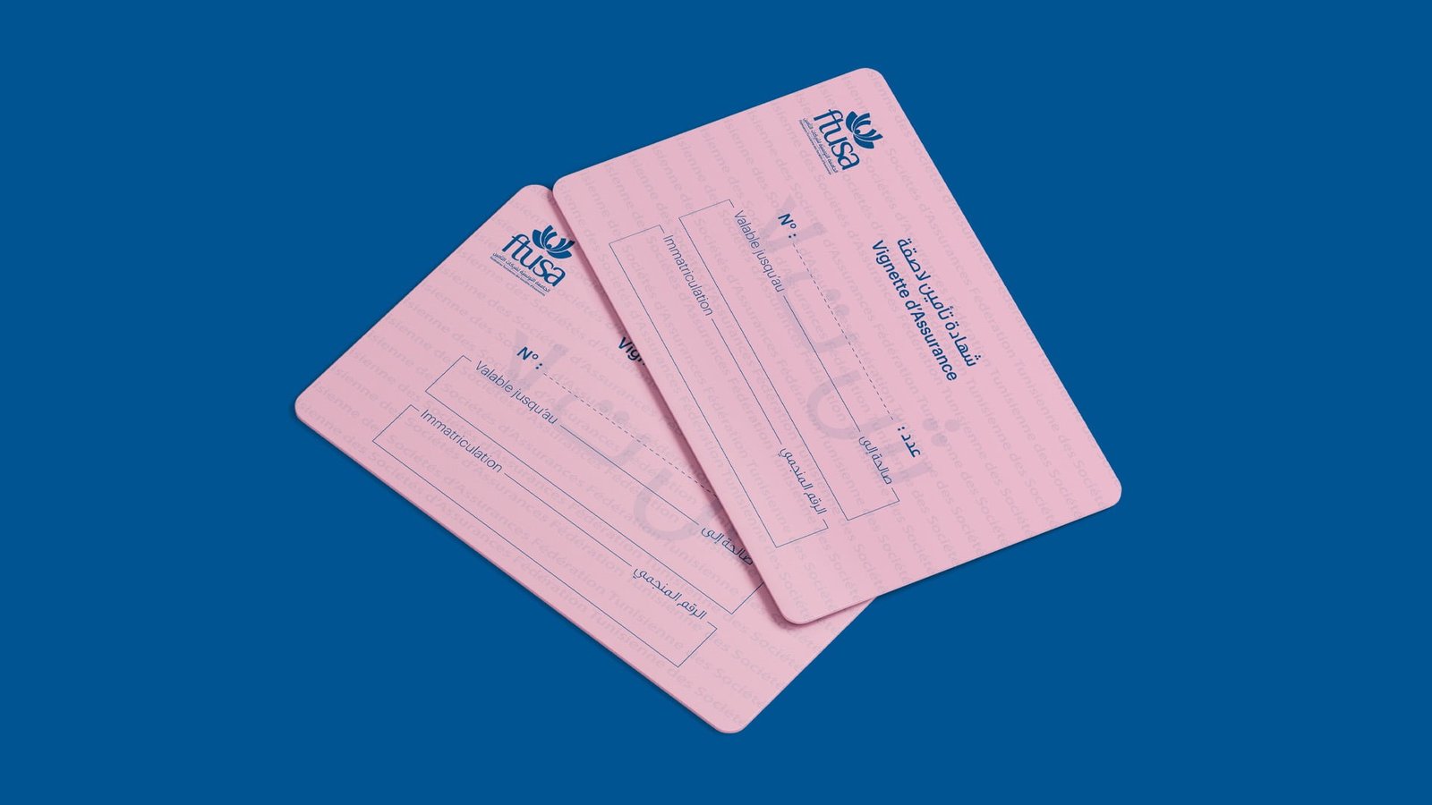
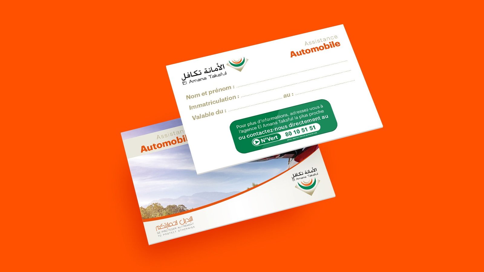
Small rectangular sticker issued by the insurer, to be affixed to the windshield of the car or to the surface in front of a two or three-wheeler.
The sticker indicates the number of the insurance contract, the registration number of the vehicle (or the engine if it is not subject to registration), and the validity of the contract.
The stub indicates the contact details of the insurer, the number of the insurance contract, the registration number of the vehicle (or of the engine if it is not subject to registration), the start and end dates of validity of the insurance contract.
The insurer must keep the stub with the registration card and driver’s license.
The insurer must affix the sticker in a visible place.

WHERE TO AFFIX THE INSURANCE STICKER?

For 4 wheels : at the bottom right of the windshield.
For motor vehicles with 2 or 3 wheels: on a surface located in front of the forms by the front fork of the vehicle
(for example on the front mudguard).

DISPLAY SYSTEM

For 4 wheels: Self-adhesive plastic film. For motor vehicles with 2 or 3 wheels: Aluminum sticker holder.

STICKER MENTIONS

The sticker must mention :
1 ° / The subscriber number.
2 ° / The vehicle registration (or the engine number if it is not subject to registration).
3 ° / Validity.

Insurance Sticker For Motor Vehicles

DISPLAY SYSTEM

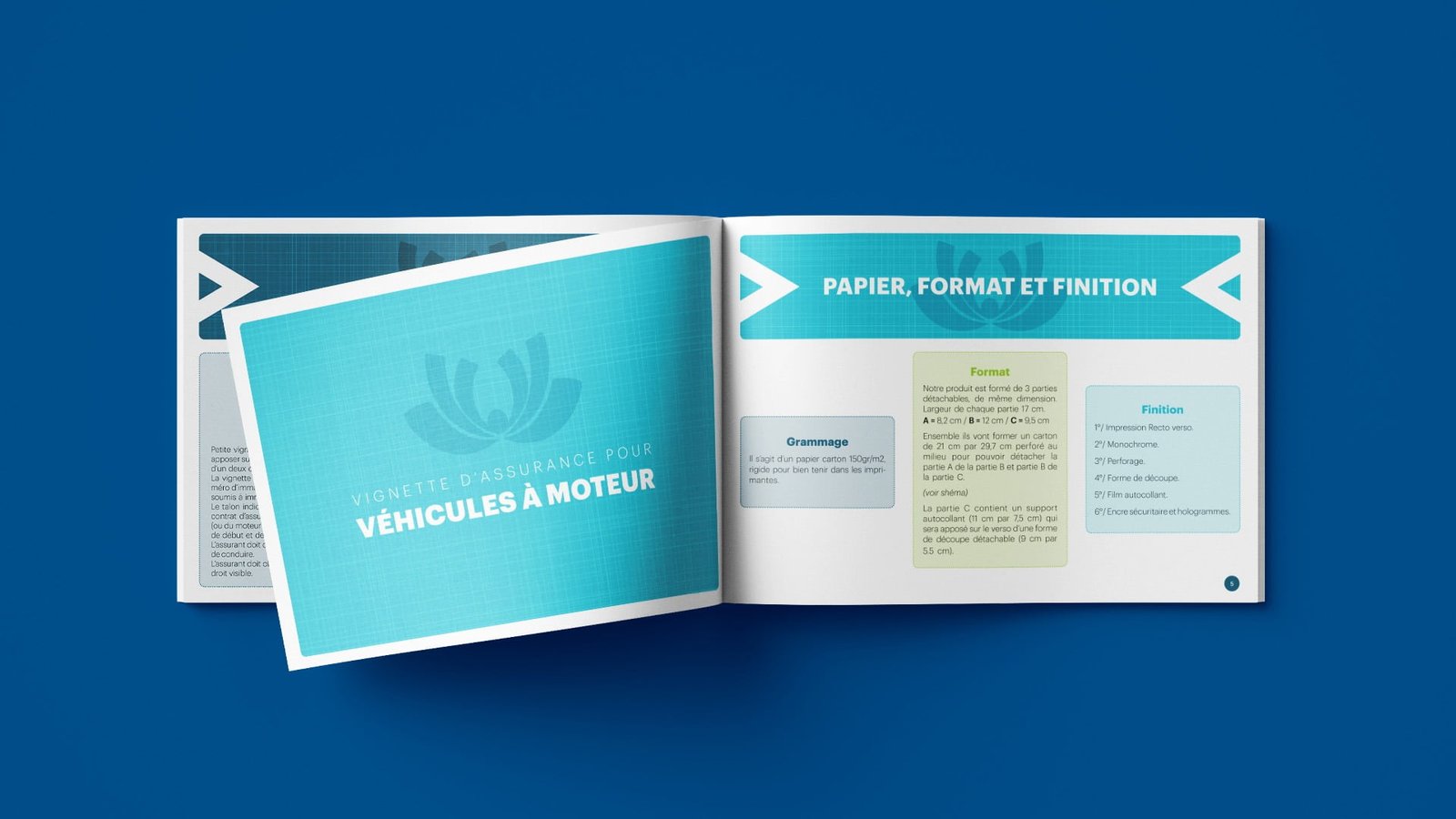
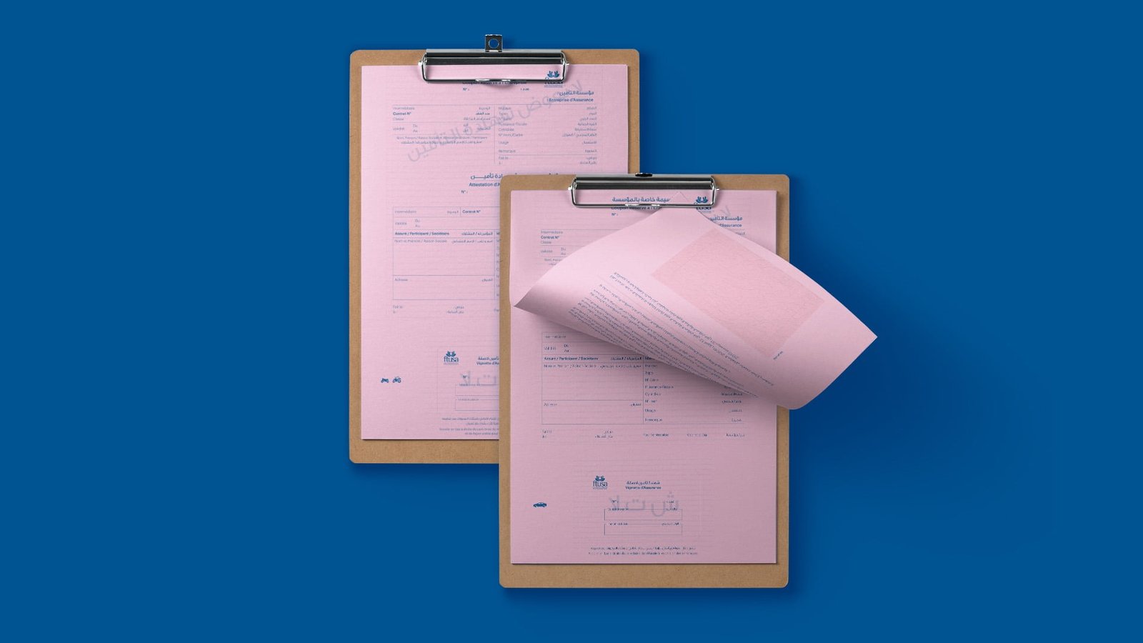
It is a 150gr / m2 cardboard paper, rigid to hold well in printers.

FORMAT

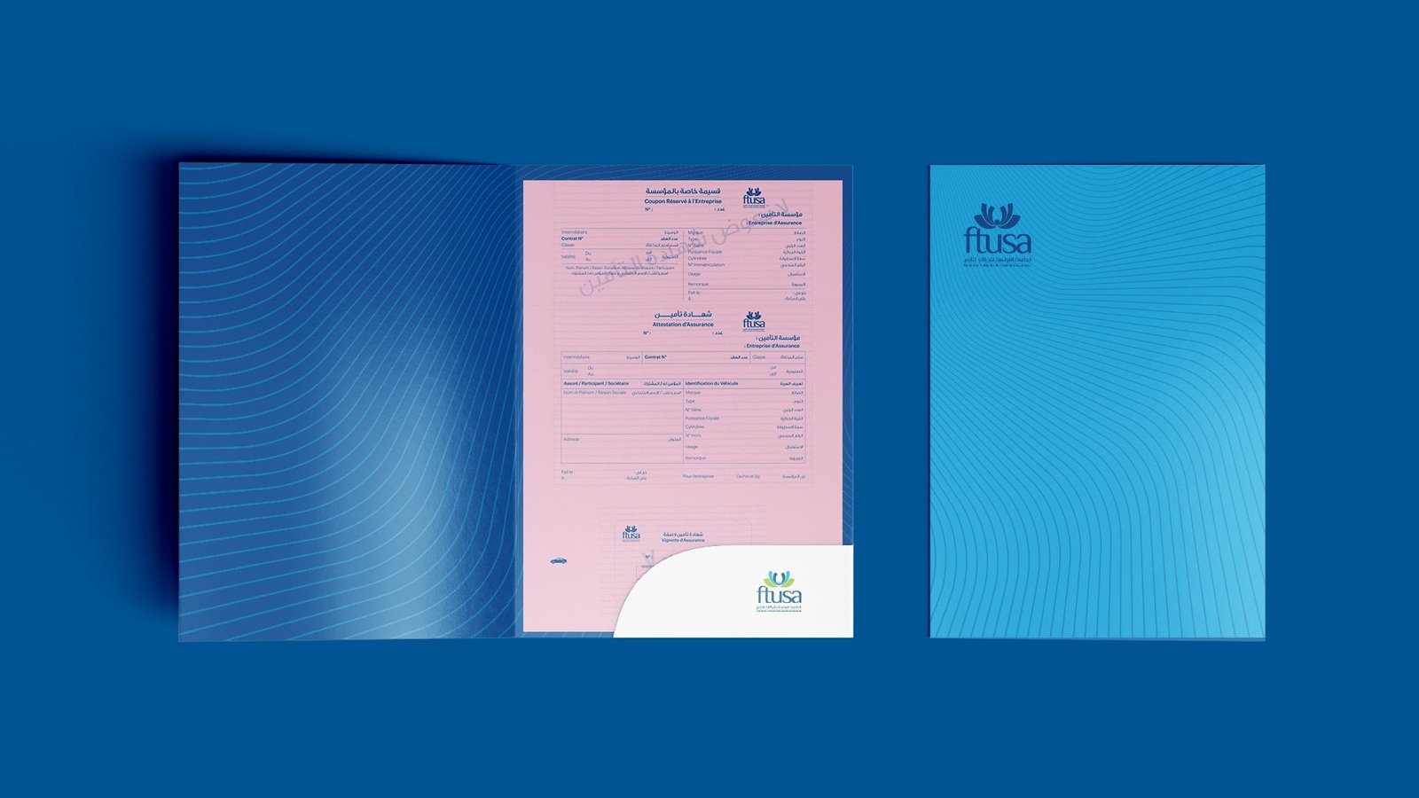
Our product is made up of 3 detachable parts of the same size. Width of each part 17 cm.
A = 8.2cm / B = 12cm / C = 9.5cm
Together they will form a cardboard 21 cm by 29.7 cm perforated in the middle to be able to detach part A from part B and part B from part C.
Part C contains a self-adhesive backing (11 cm by 7.5 cm) which will be affixed to the back of a detachable cutout form (9 cm by 5.5 cm).

FINISH

1 ° / Double-sided printing.
2 ° / Monochrome.
3 ° / Perforation.
4 ° / Cutout shape.
5 ° / Self-adhesive film.
6 ° / Security ink and holograms. backing (11 cm by 7.5 cm) which will be affixed to the back of a detachable cutout form (9 cm by 5.5 cm).

Projects
Projects
Projects

Brand Colors

Projects
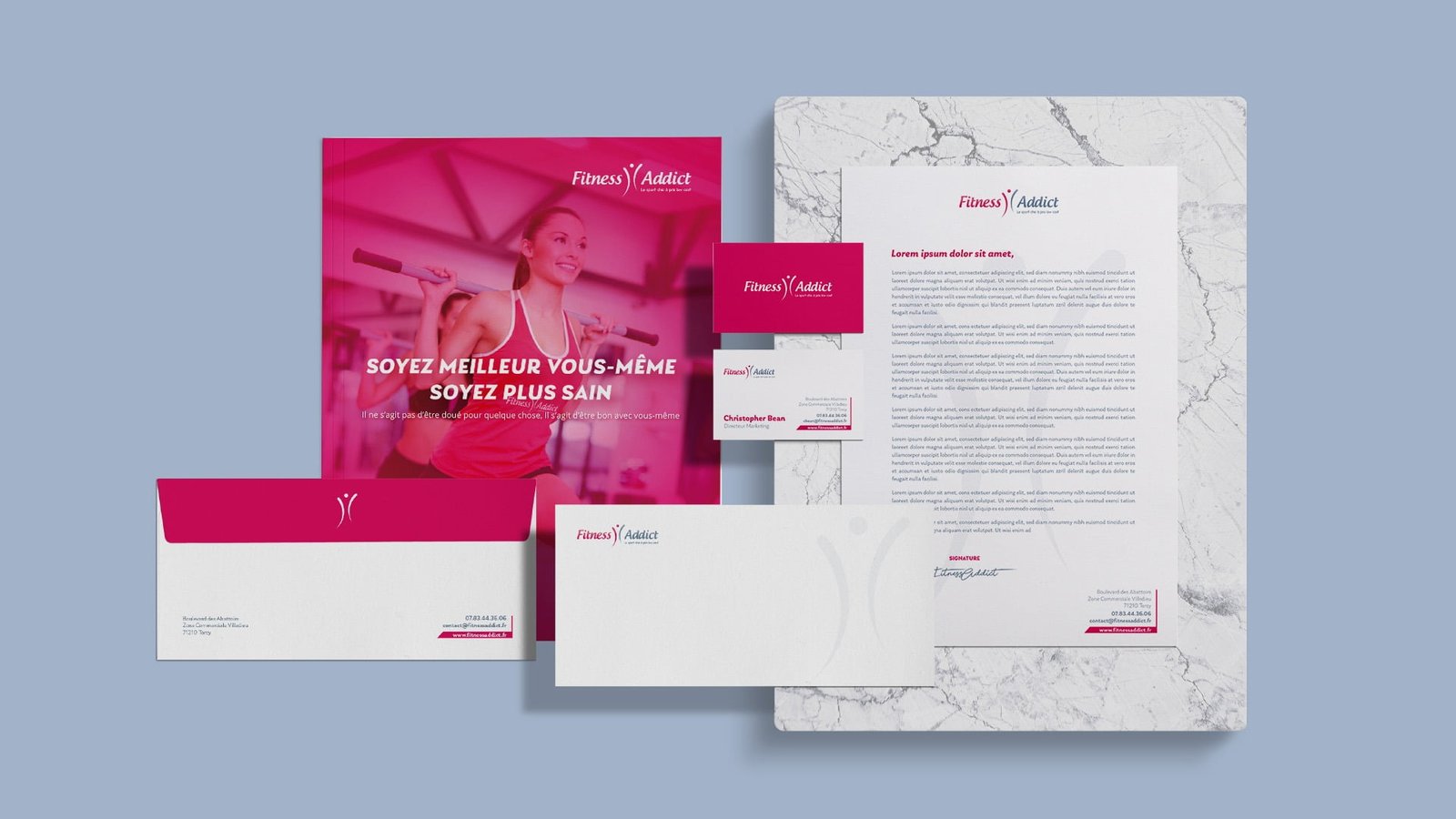
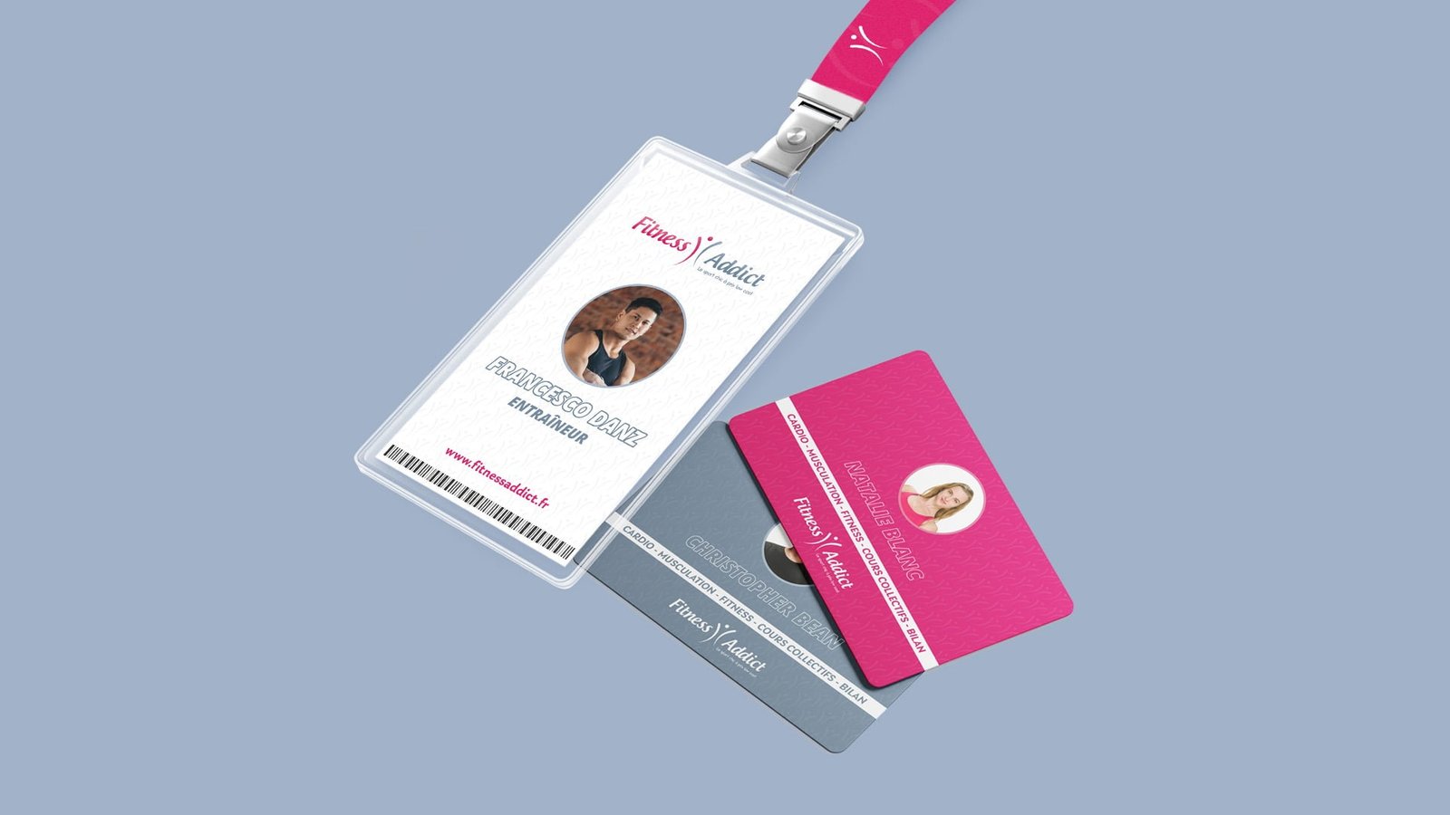
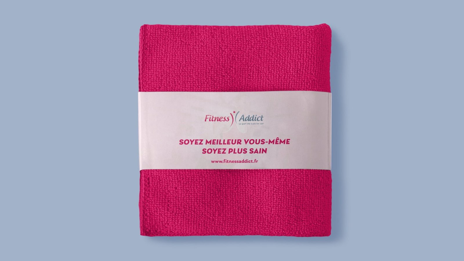
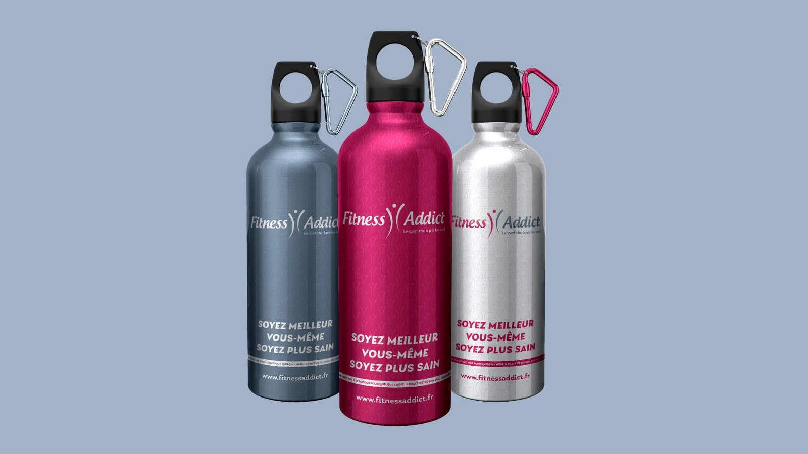
Fitness Addict Design

Providing a comfortable
workout environment

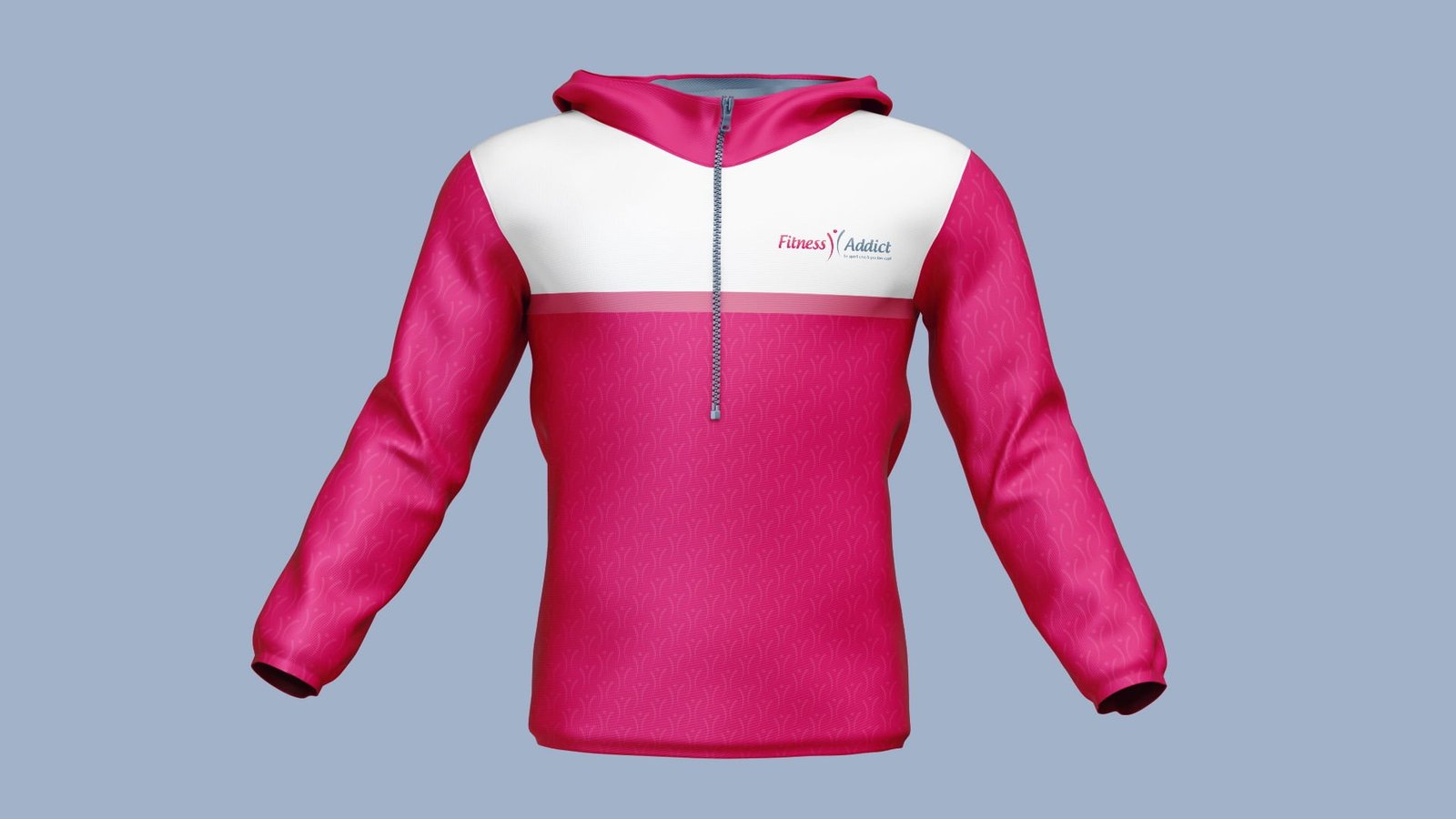
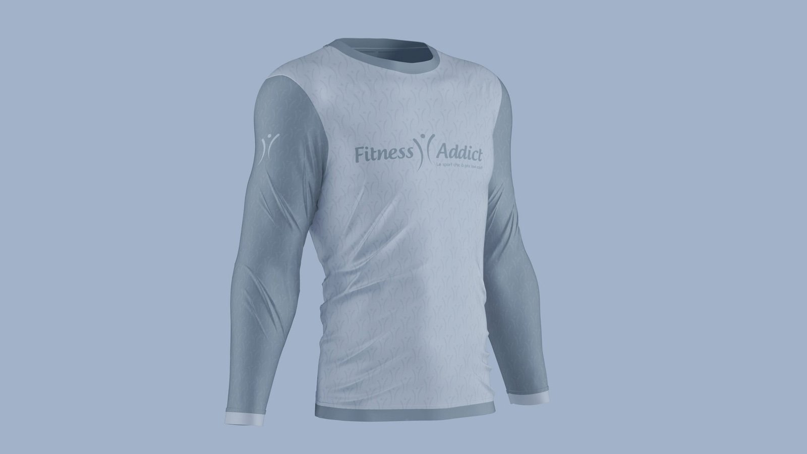
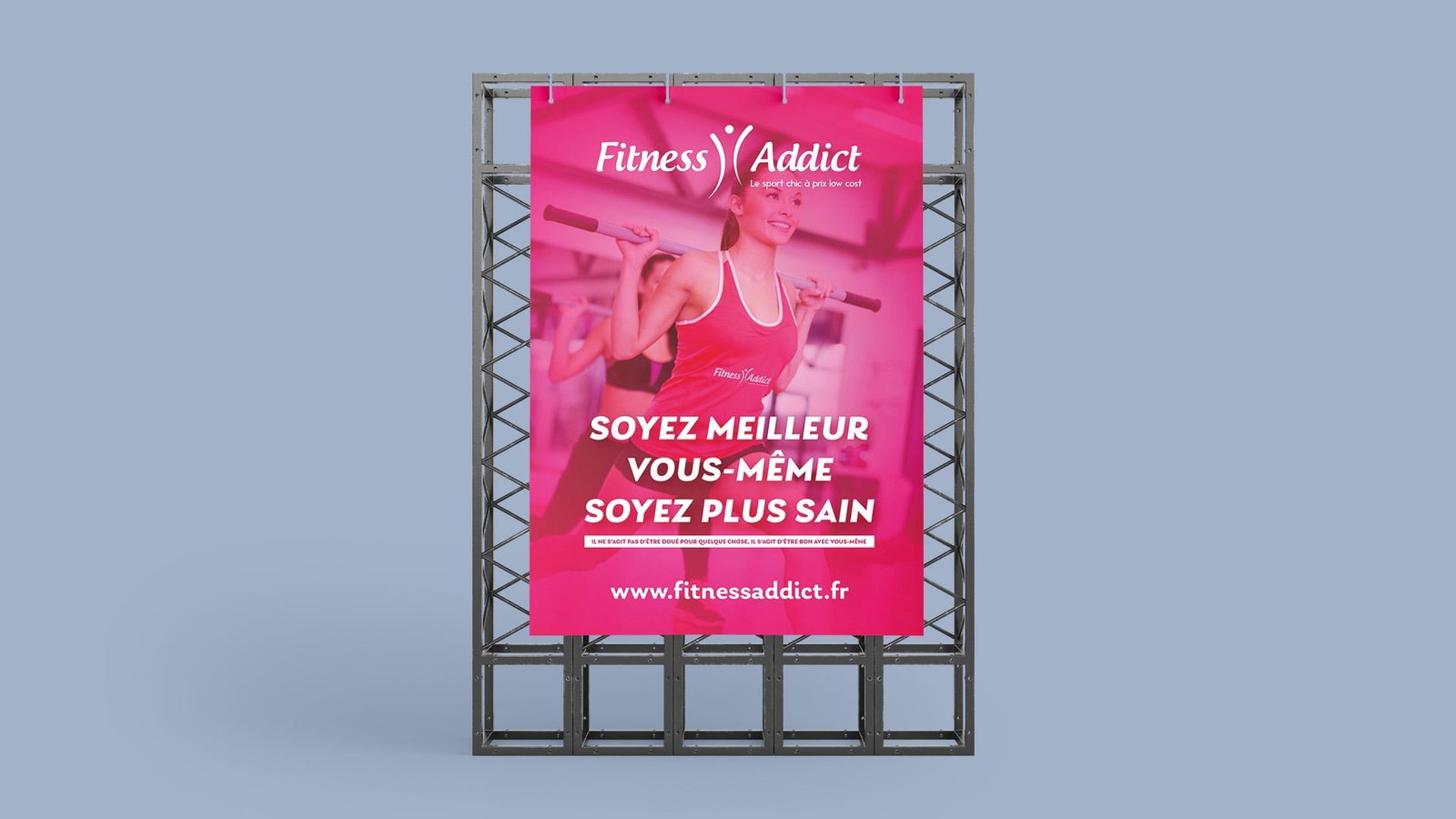
Fitness Addict is a chic gym (cardio – fitness – bodybuilding) Offering quality service and equipped with state-of-the-art devices.

Projects

Logo Construction

Projects
Projects

Whether you believe in the Golden Ratio or not, our experience is that
this technique helps to build balanced, aesthetic shapes.

RESPONSIVE LOGO / GRID Sizes and Clear Spaces

Projects
Projects

APP ICON

iOS

The icon has been designed according to iOS
app icon guidelines with a few modifications
to achieve optimal readability, yet maitain
consistency with the iOS ecosystem.

Projects
Projects
Projects

Android

The Android icon has been created based on Google Material Design Guidelines.
We chose the circle as the main icon shape
to achieve better shape contrast.

Projects

Use on different Background

Projects
Projects

Brand Colors

Projects

The GRADIENT

Projects
Projects
Projects
Projects
Projects
Projects
Projects
Projects
Projects
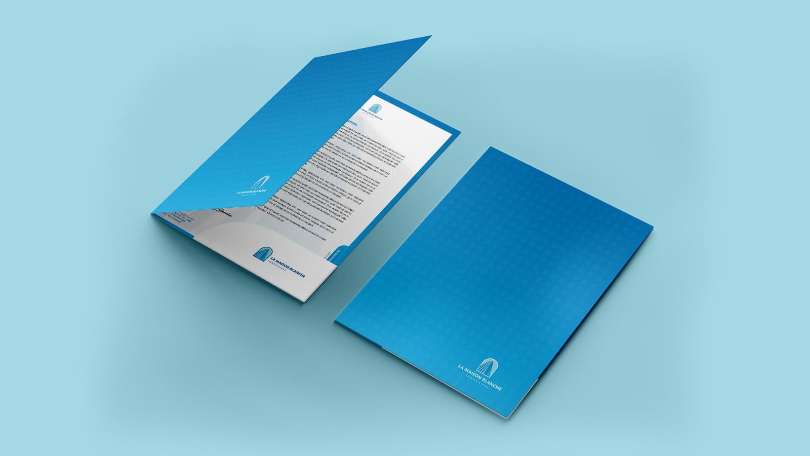
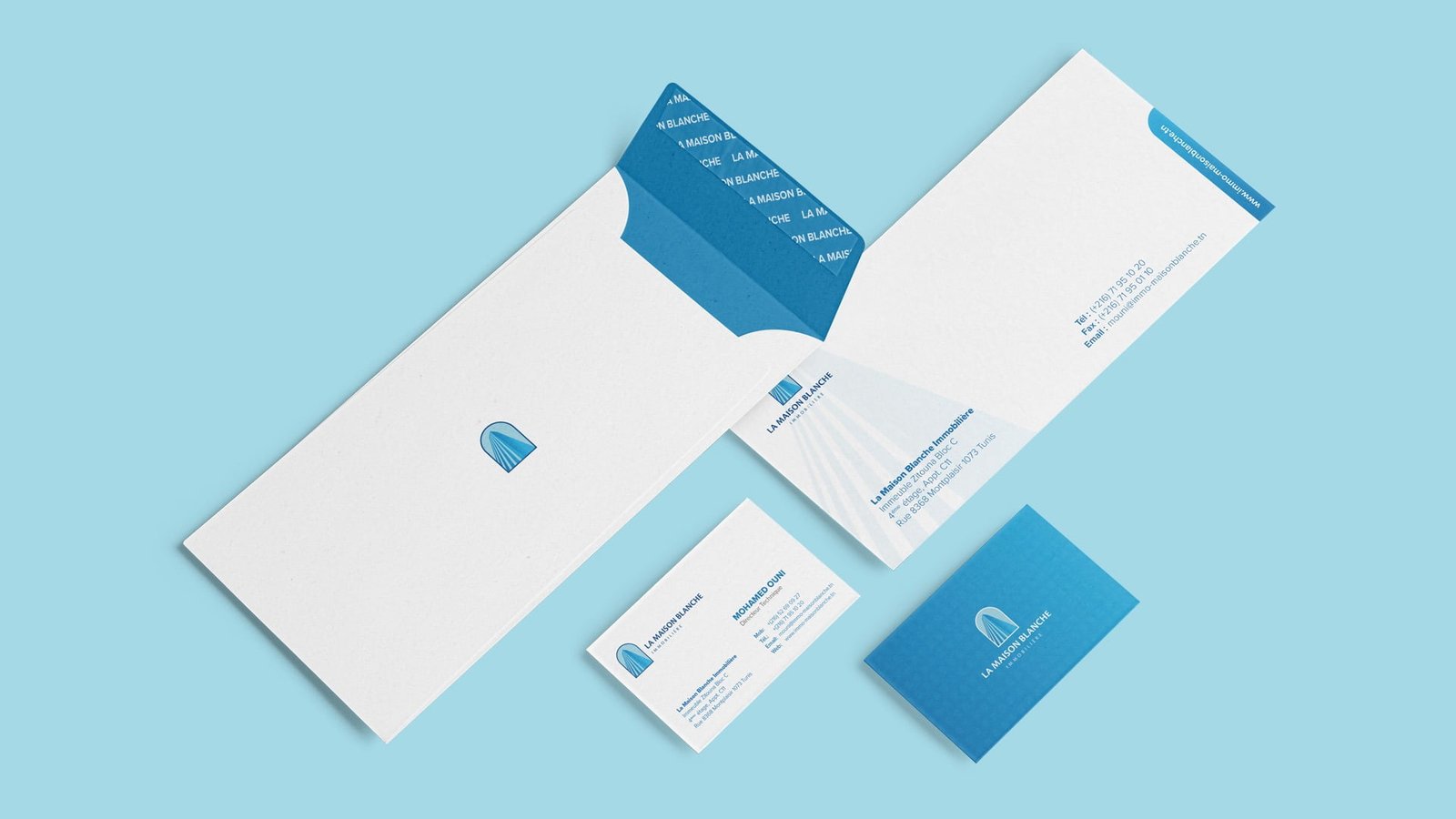
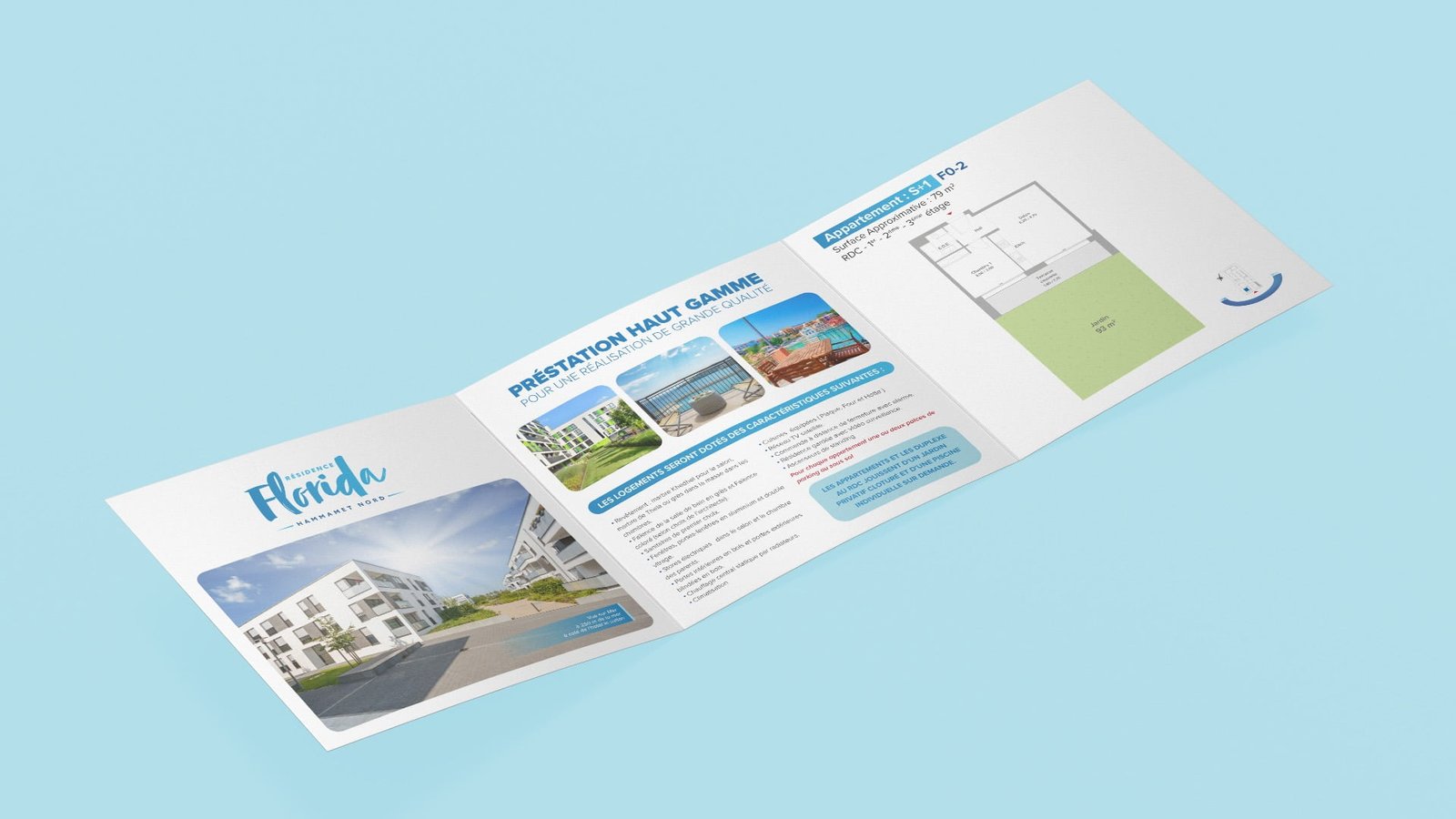
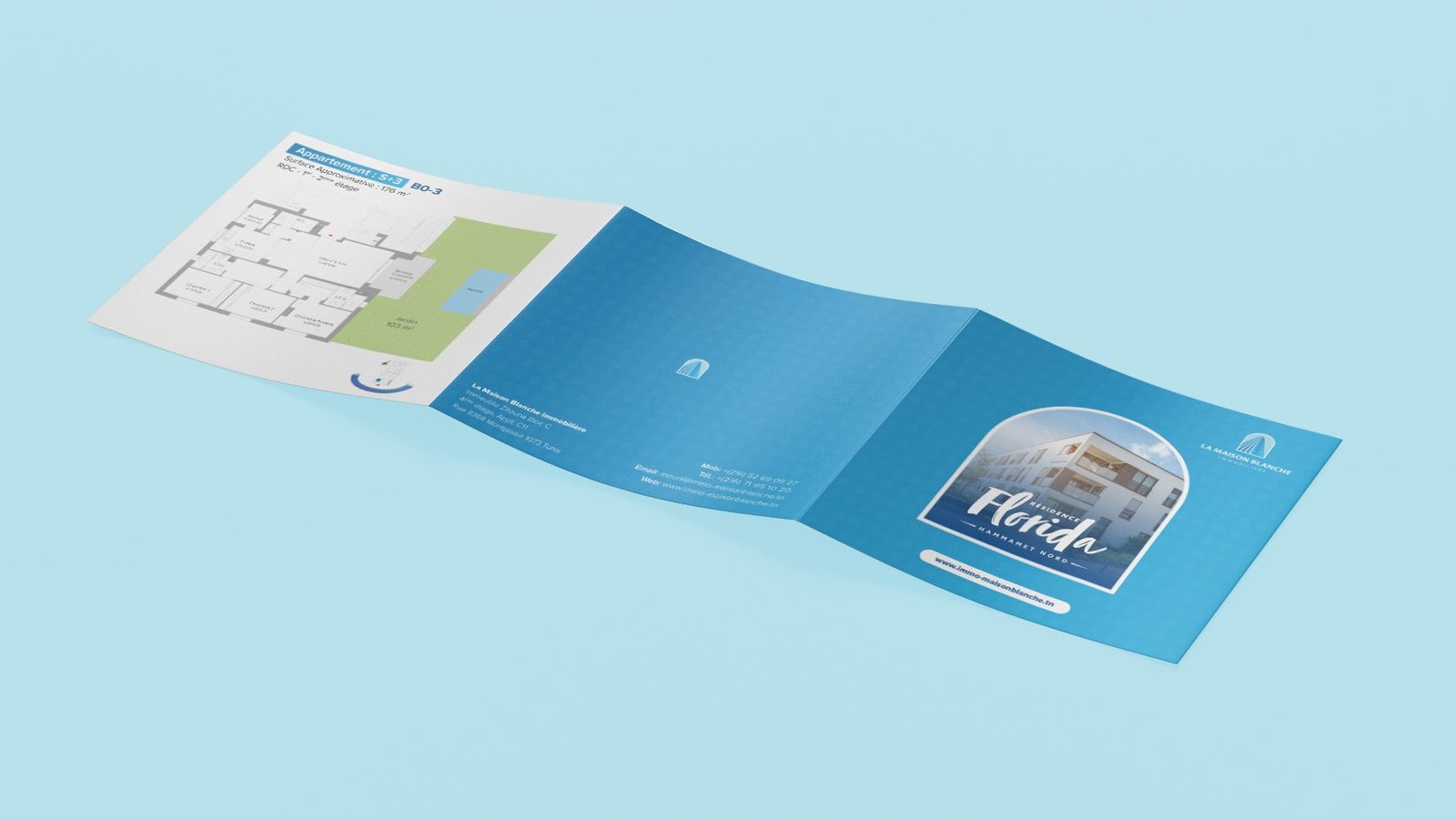
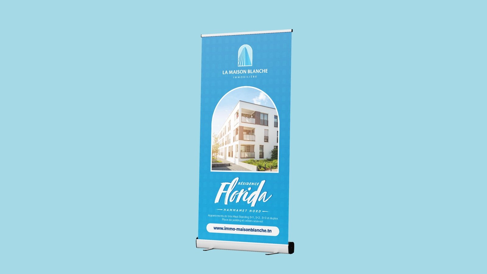
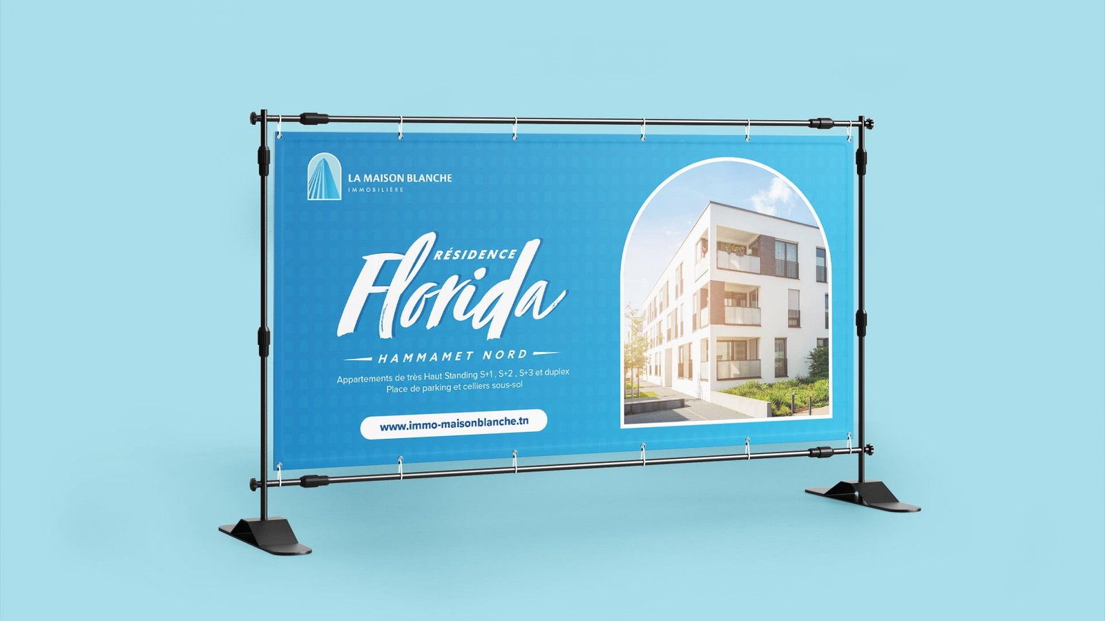
La maison Blanche Design

Building and selling
houses and apartments

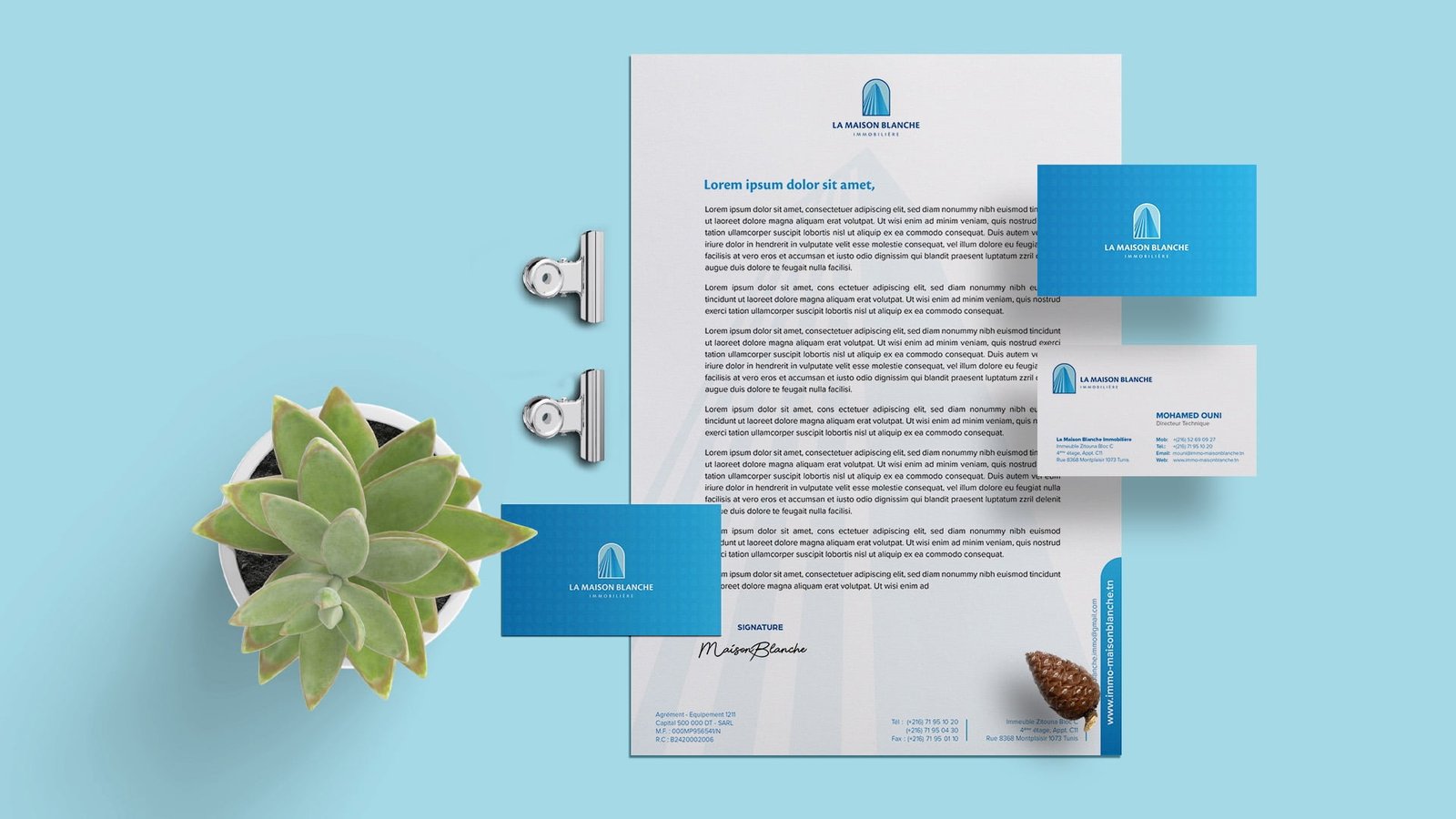
La Maison Blanche Immobilière is a company recognized in Tunisia for the quality and high standard of its achievements, it has long distinguished itself by its sense of innovation, its seriousness and its know-how. Building to last, building to seduce, these are its fundamental values.

Projects

RESPONSIVE LOGO / GRID Sizes and Clear Spaces

Projects
Projects
Projects

Arabic Version

Projects
Projects

Use on different Background

Projects
Projects

Brand Colors

Projects

The GRADIENT

Projects
Projects
Projects
Projects
Projects
Projects
Projects
Projects
Projects
Projects
Projects
Projects
Projects

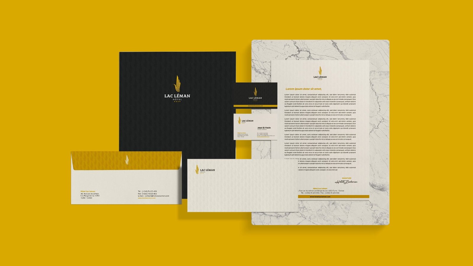
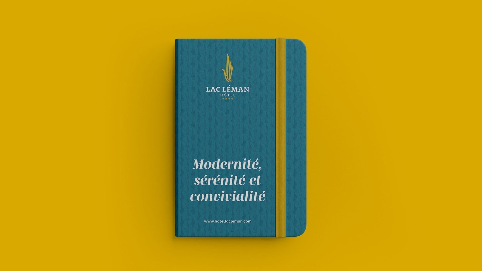
Delivering exceptional
guest experiences

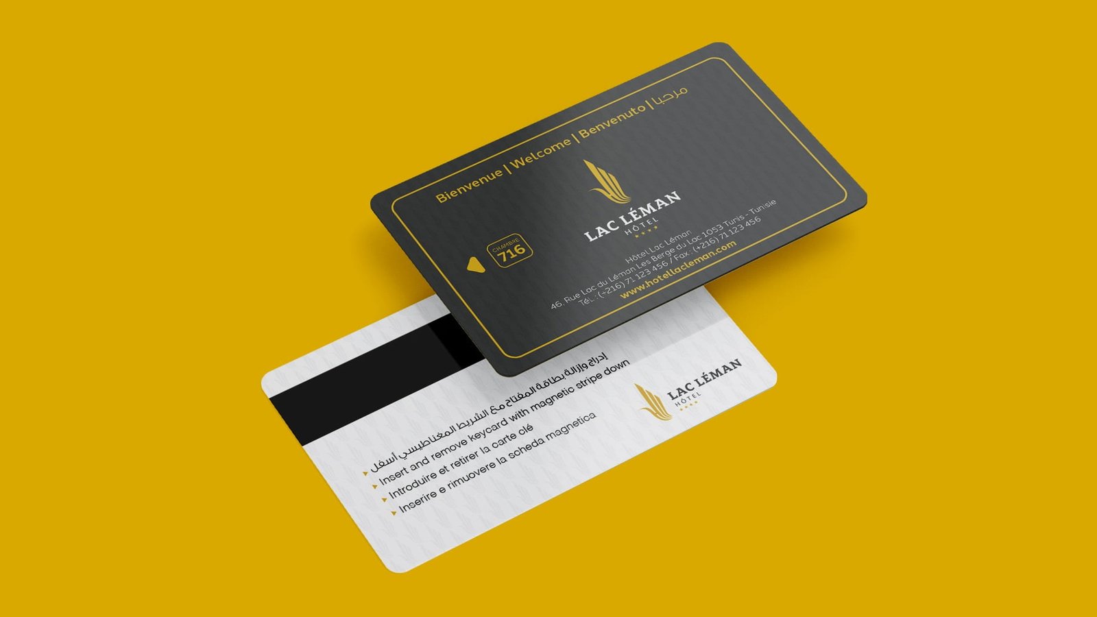
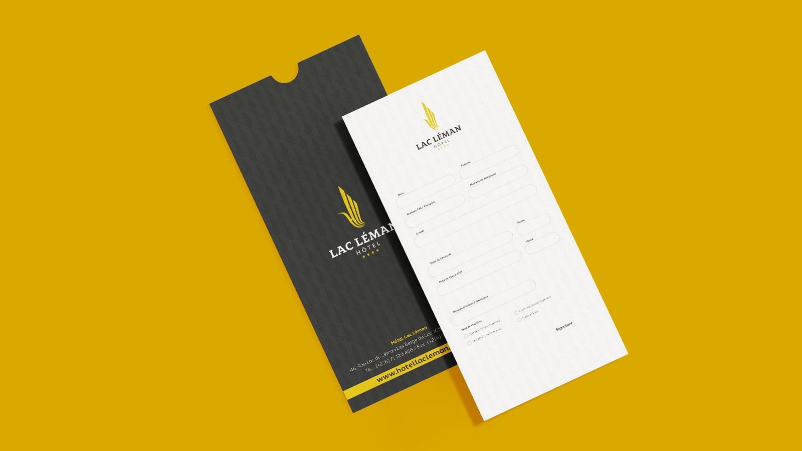
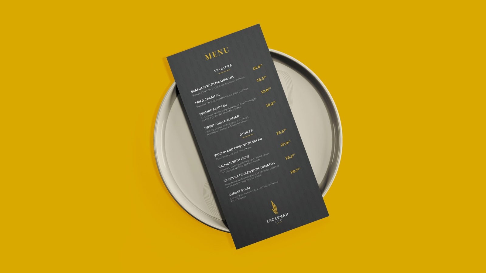
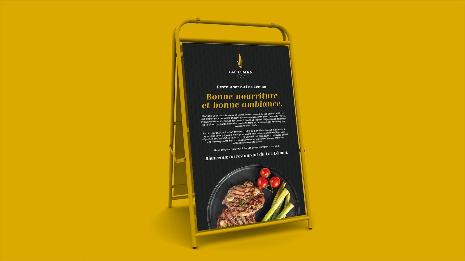
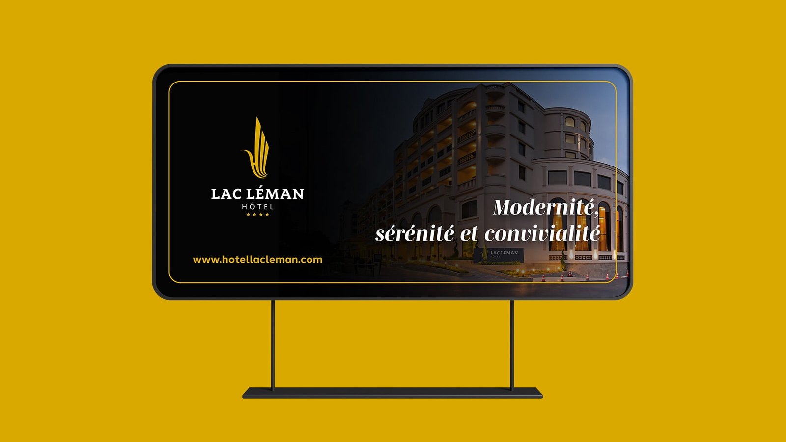
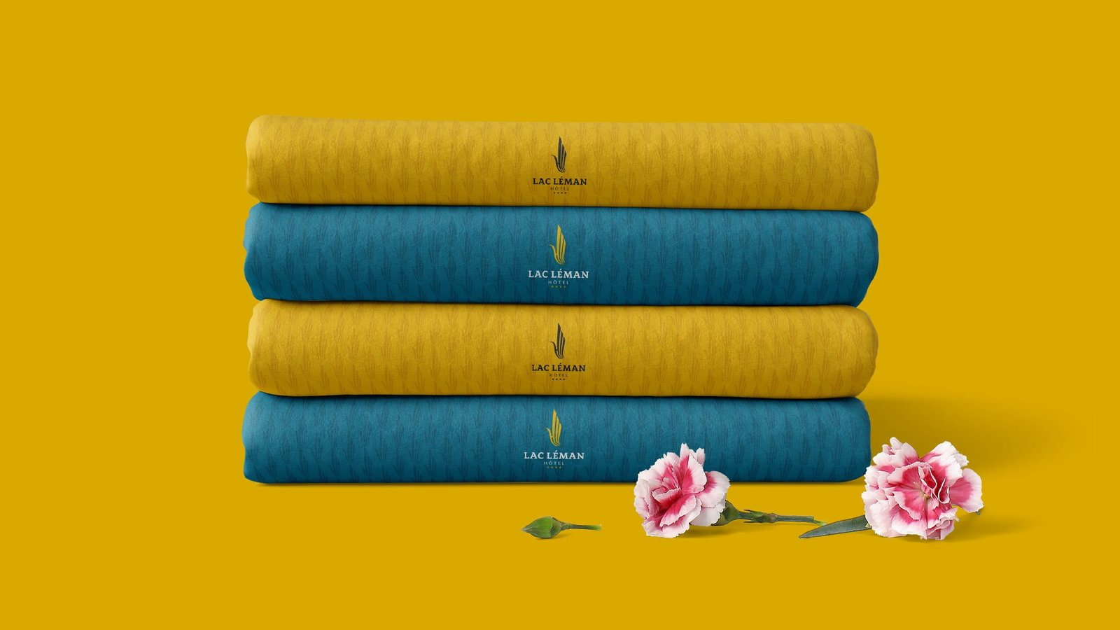
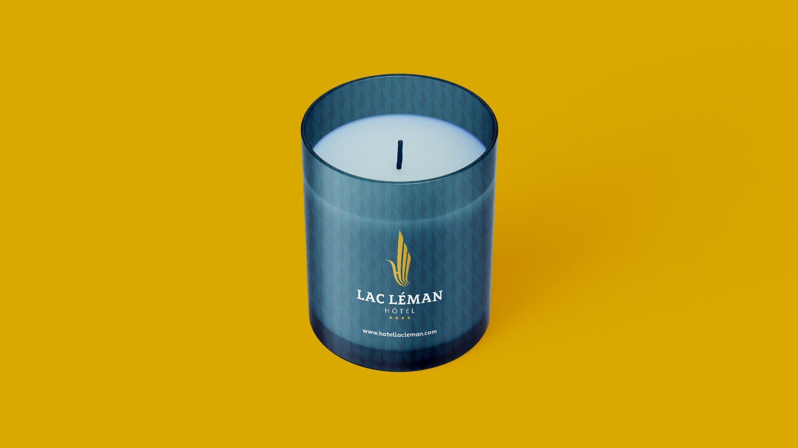
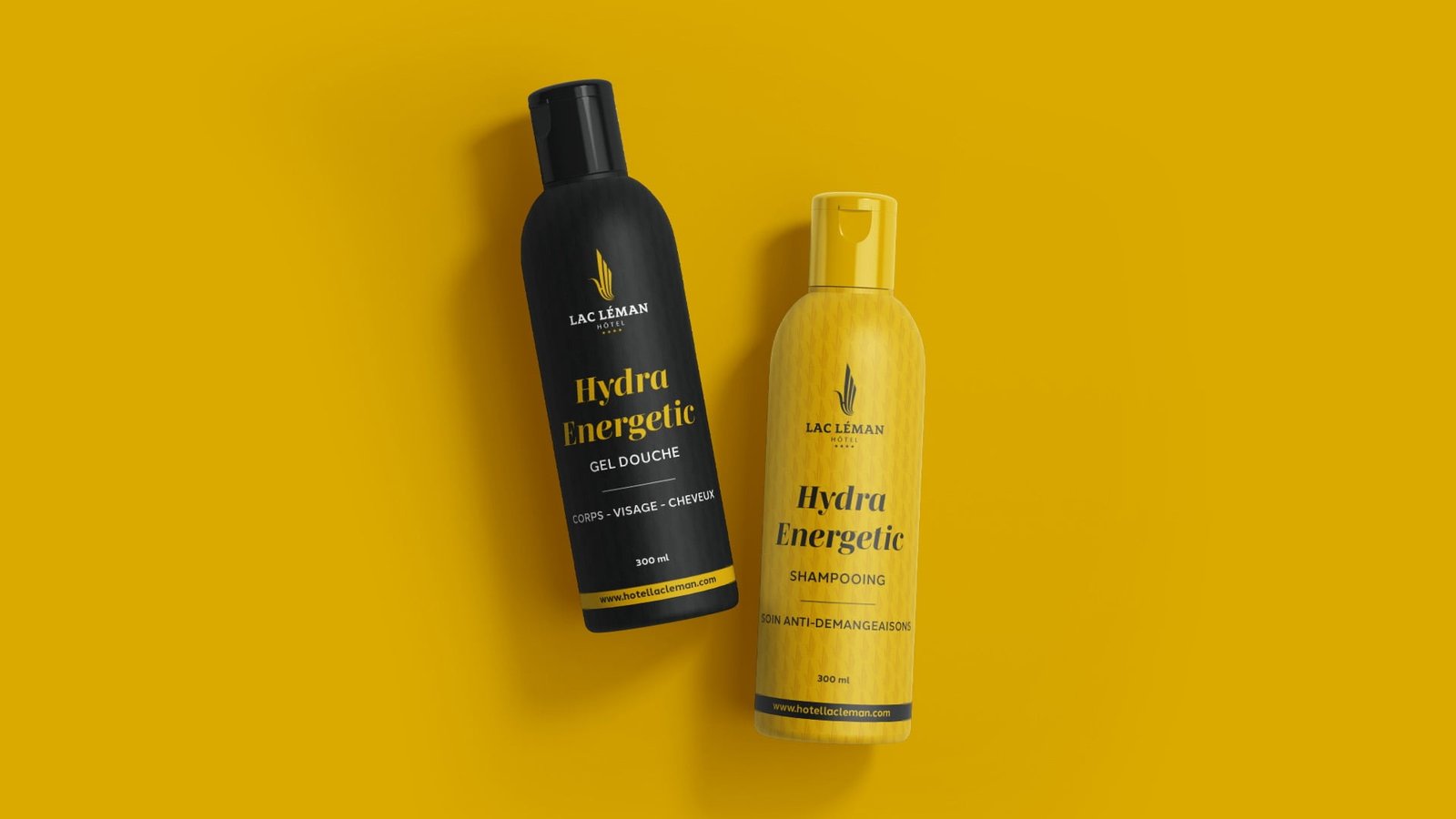
Lac Leman is a luxury hotel headquartered in Tunis, Tunisia. The vision was to establish an innovative brand identity for an ultra-luxury hotel that will become a new landmark of Tunisia and one of the leading luxury resorts in the Mediterranean region.

Projects

RESPONSIVE LOGO / GRID Sizes and Clear Spaces

Projects
Projects
Projects

Use on different Background

Projects
Projects

Brand Colors

Projects
Projects
Projects
Projects
Projects
Projects
Projects
Projects
Projects
Projects
Projects
Projects
Projects
Projects
Radiomed - UX/UI Design
Projects

Teaching to become
a good seller

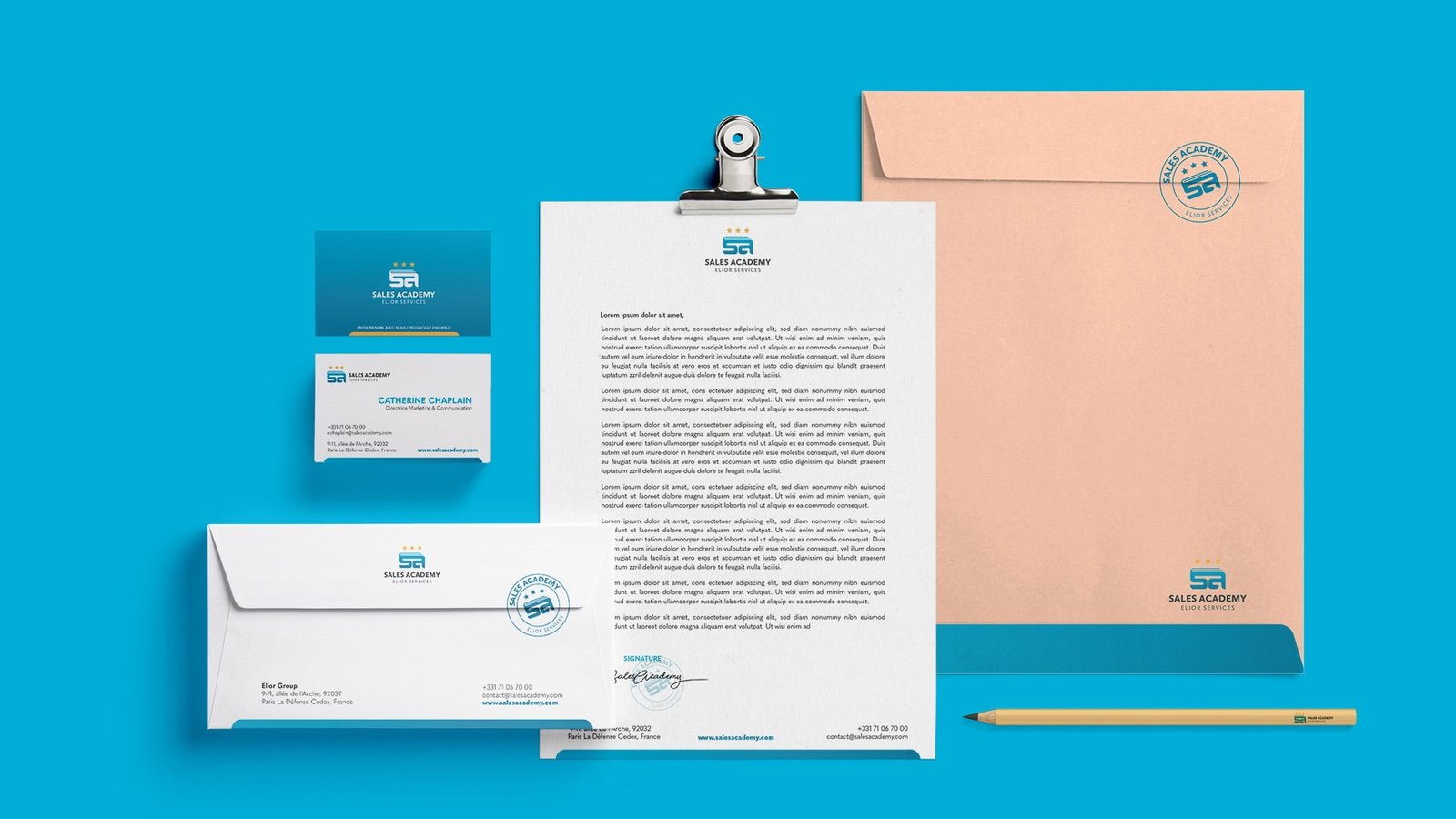
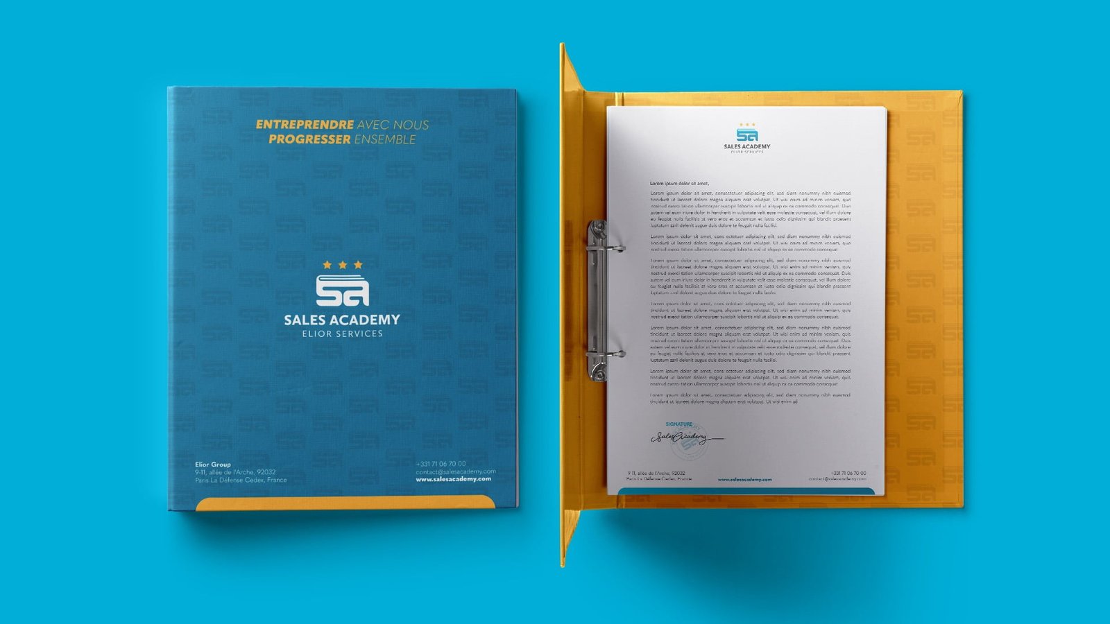
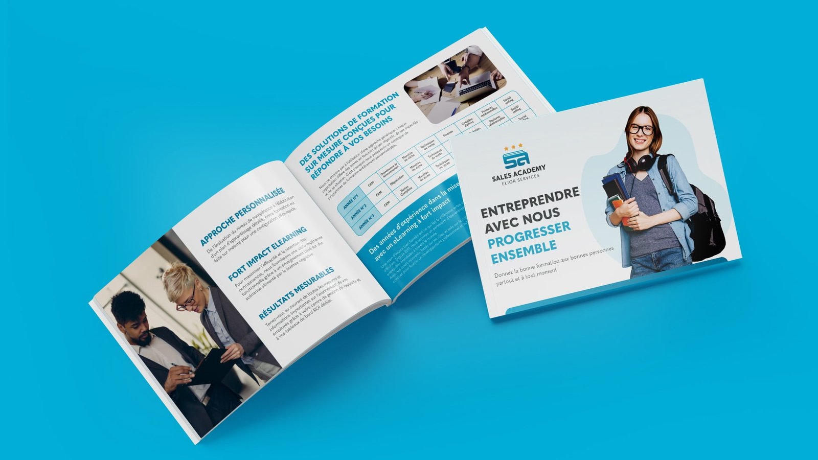
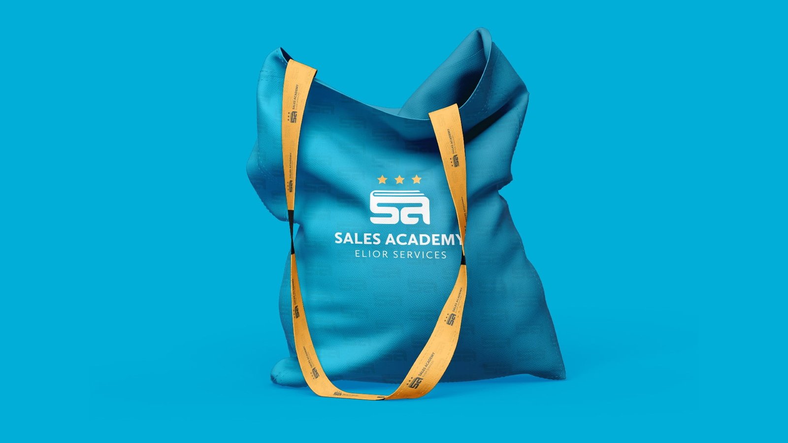
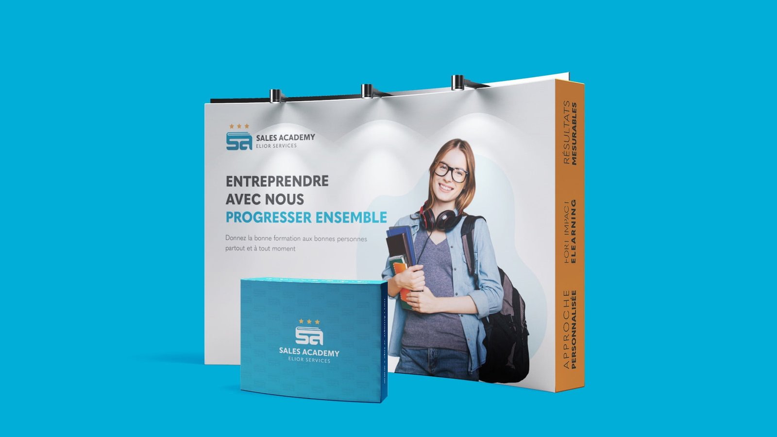
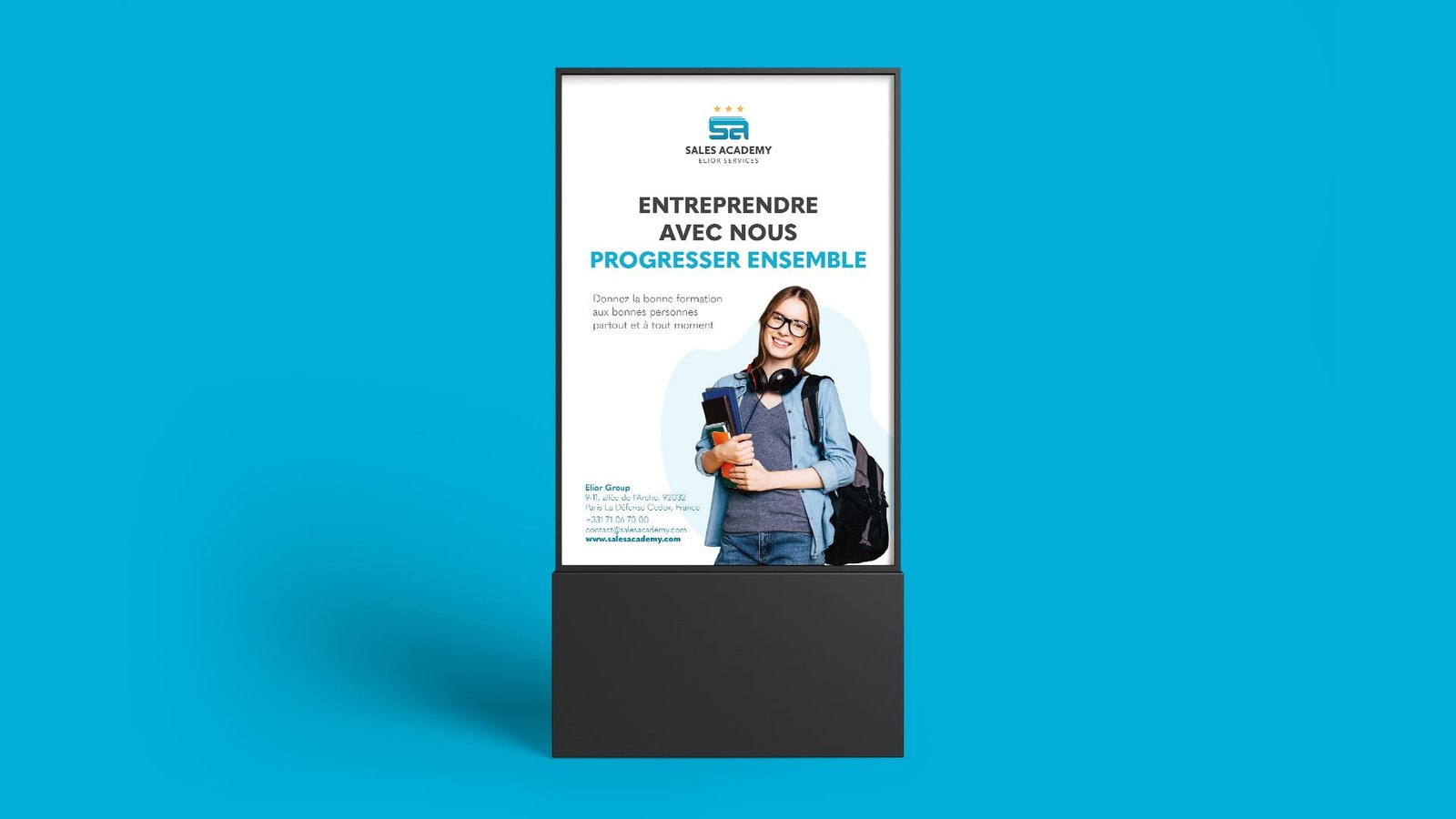
The Sales Academy is an internal university dedicated to the sales professions at Elior Service.
It was entirely designed for Elior Services: it is a tailor-made program that will be delivered by external and internal stakeholders.
The program will be Program divided into 3 levels (novice, median, expert)

Projects

LOGO CONCEPT

Projects

Logo Construction

Projects
Projects

Whether you believe in the Golden Ratio or not, our experience is that
this technique helps to build balanced, aesthetic shapes.

RESPONSIVE LOGO / GRID Sizes and Clear Spaces

Projects
Projects
Projects

Use on different Background

Projects
Projects

Brand Colors

Projects

The GRADIENT

Projects
Projects
Projects
Projects
Projects
Projects
Projects
Projects
Projects
Projects
Projects
Projects
Projects
Projects
Projects
Projects

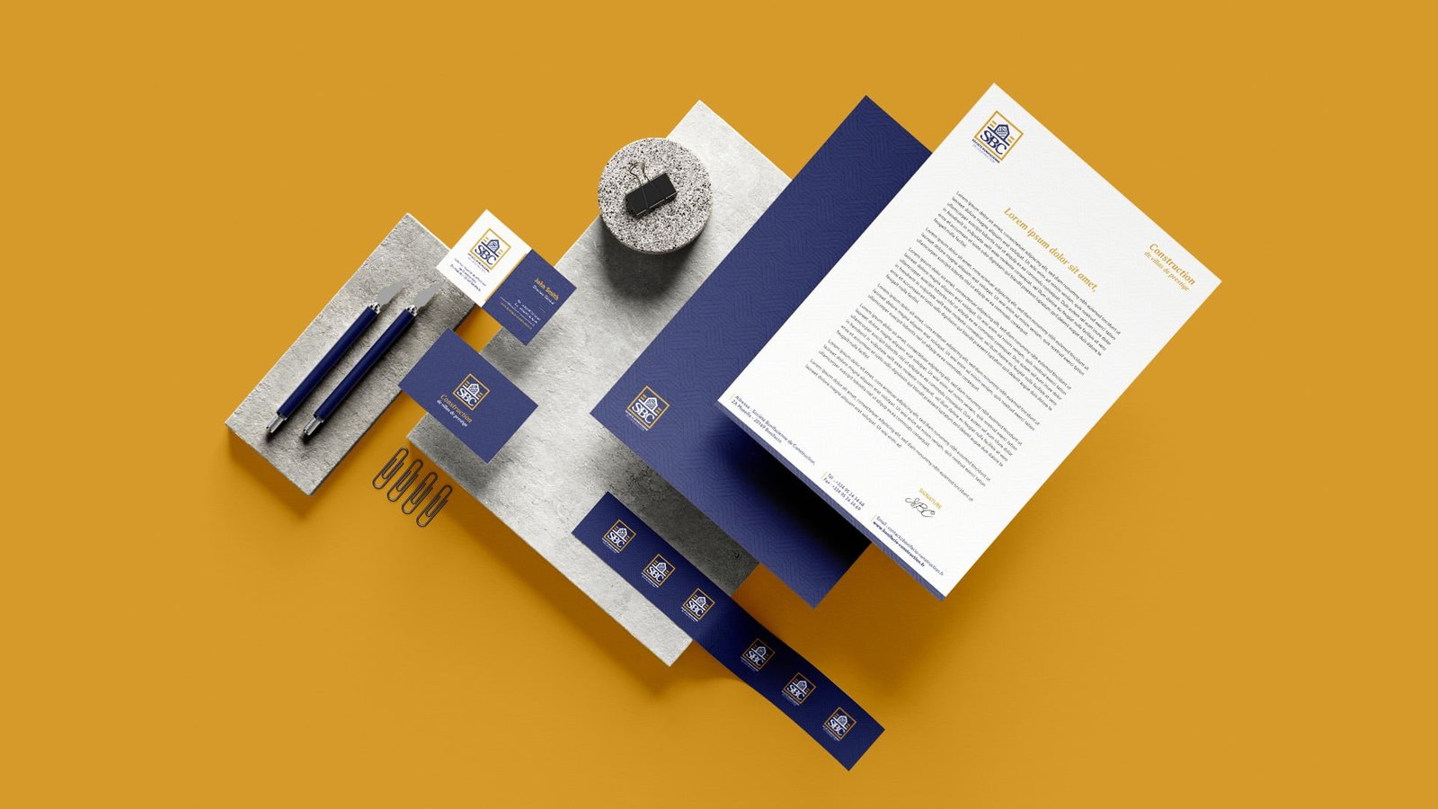
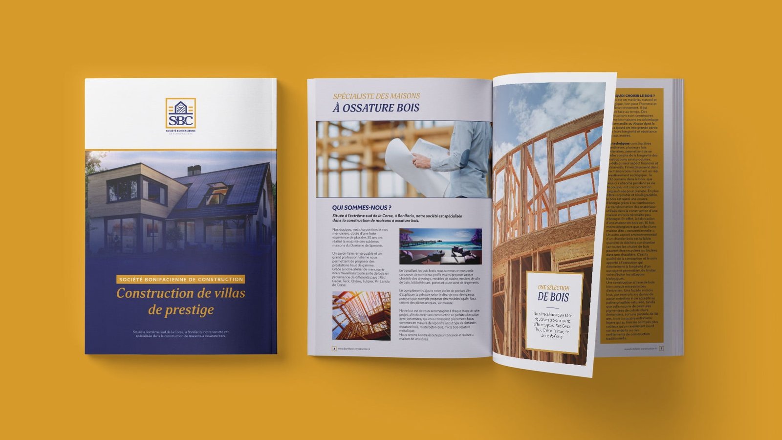
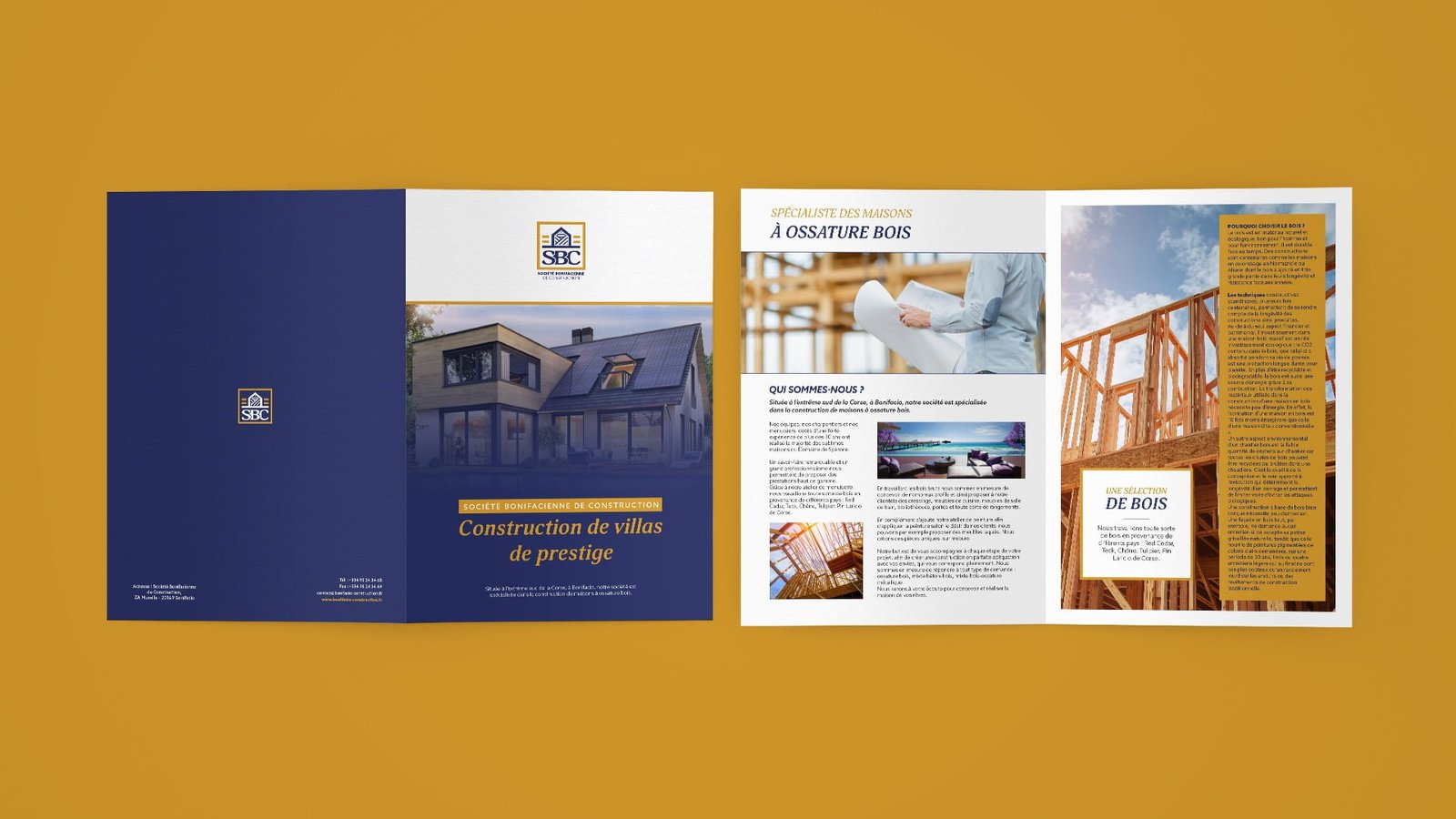
Designing and building
luxury wooden house

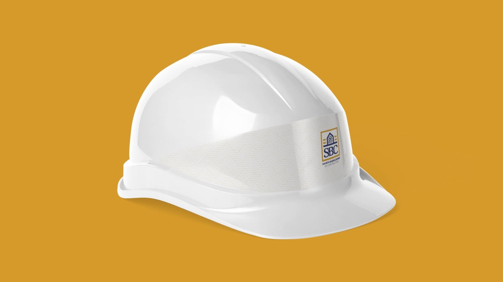
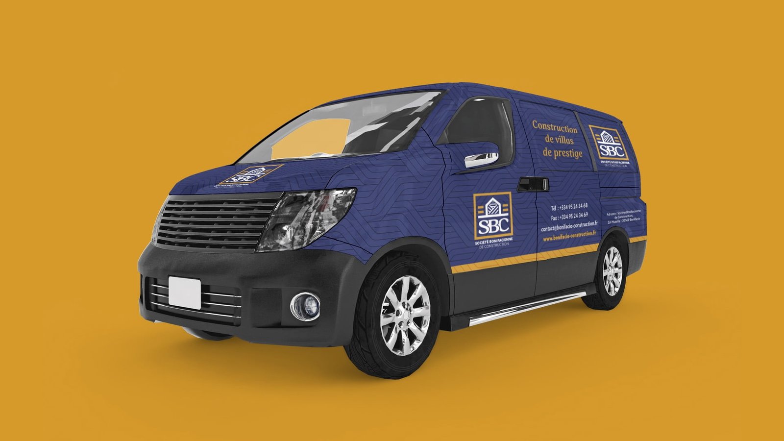
SBC is a Construction of high-end villas with wooden structure.
The ambition is national, where the other actors are essentially local. Wood is a central element of the constructions carried out (minimum wood structure), and these are in a premium range.

Projects

LOGO CONCEPT

Projects

Logo Construction

Projects

RESPONSIVE LOGO / GRID Sizes and Clear Spaces

Projects
Projects

Use on different Background

Projects
Projects

Brand Colors

Projects
Projects
Projects
Projects
Projects
Projects
Projects
Projects
Projects
Projects
Projects
Projects
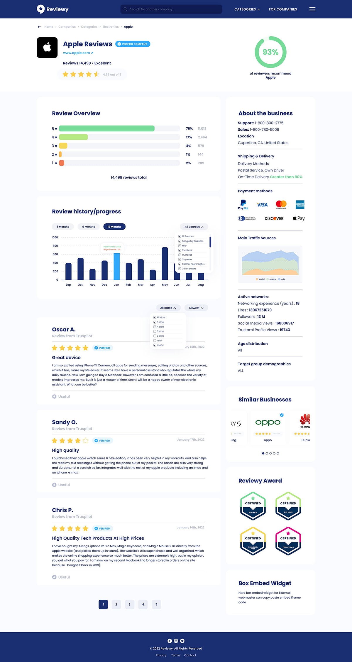
Clever Investor - UX/UI Design
Ecowood - UX/UI Design
Projects

Celebrating these 60th
of partnership US – TUN

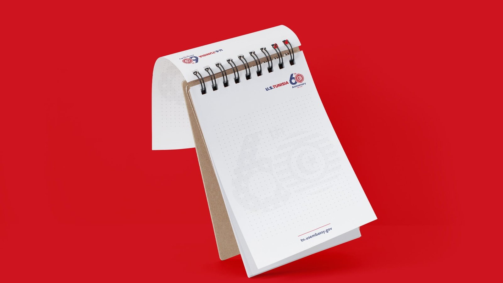
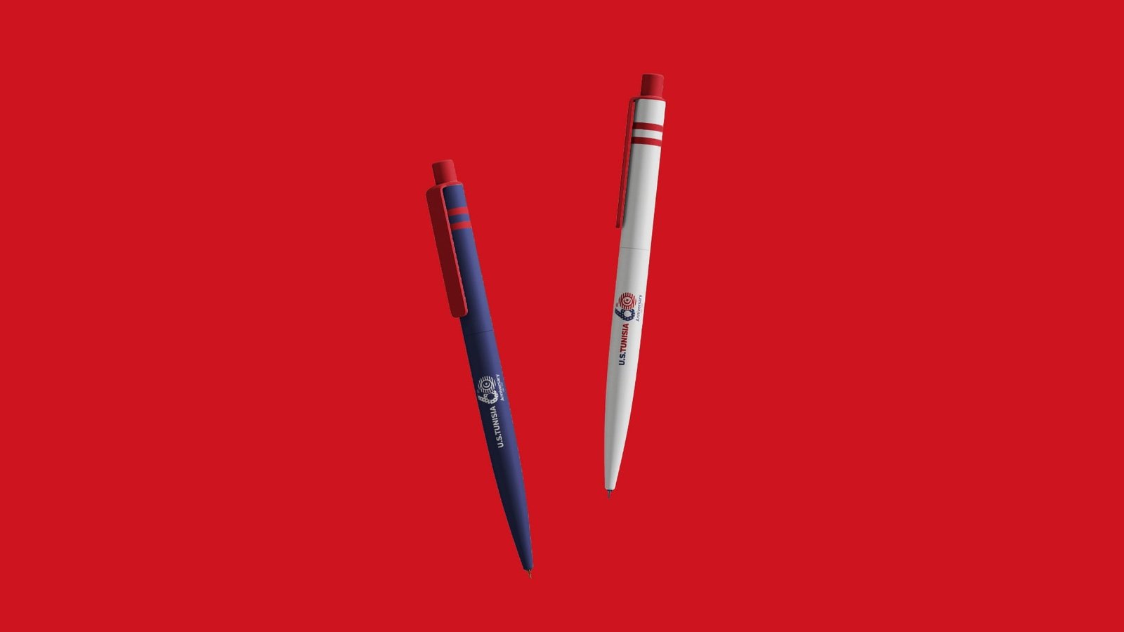
In 1956, the United States opened its Embassy in Tunis. From June 2016 to June 2017, the Embassy will be celebrating its 60 years in Tunisia. To celebrate these six decades of partnership and to kick off the next decades of working together, the U.S. Embassy will be using a special logo throughout the year.

Projects

The Embassy announces a competition to design a logo to be used from June 2016 to June 2017. The new logo may be used on the Embassy website, social media sites, business cards, letterhead, posters, souvenir trinkets and gifts, or anywhere else the Embassy chooses. The logo must be appropriate for a professional business setting.

LOGO CONCEPT

Projects

RESPONSIVE LOGO / GRID Sizes and Clear Spaces

Projects
Projects
Projects

Brand Colors

Projects
Projects
Projects
Projects
Projects
Projects
Projects
Projects
El Amana Takaful - UX/UI Design
Fitness Addict - UX/UI Design
Lac Leman - UX/UI Design
La Maison Blanche - UX/UI Design
Olivko - UX/UI Design
Projects

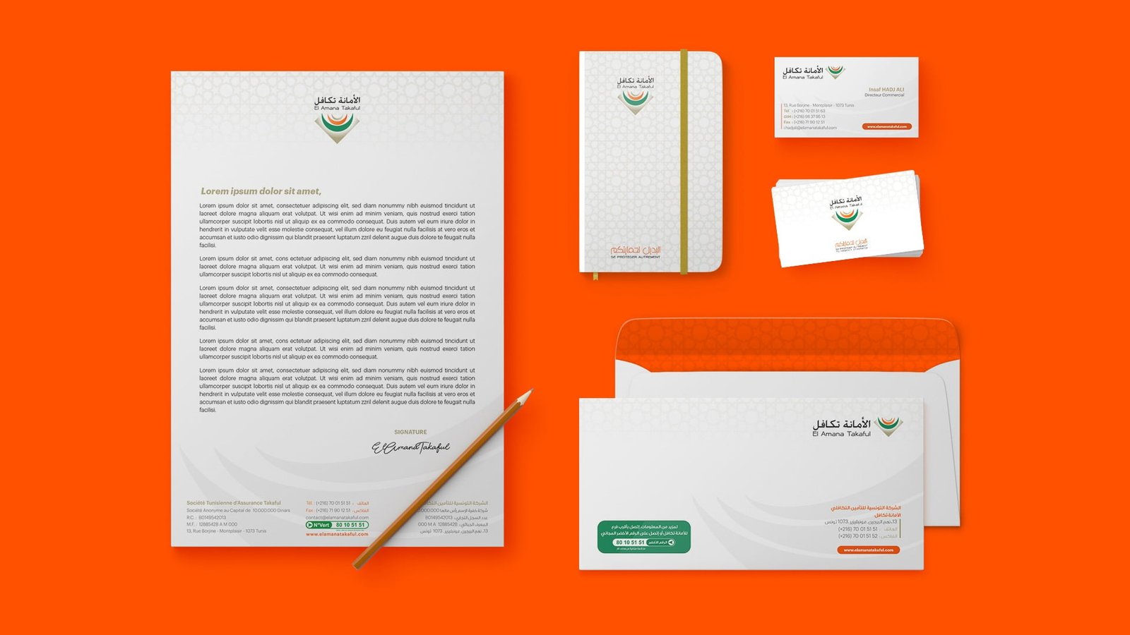
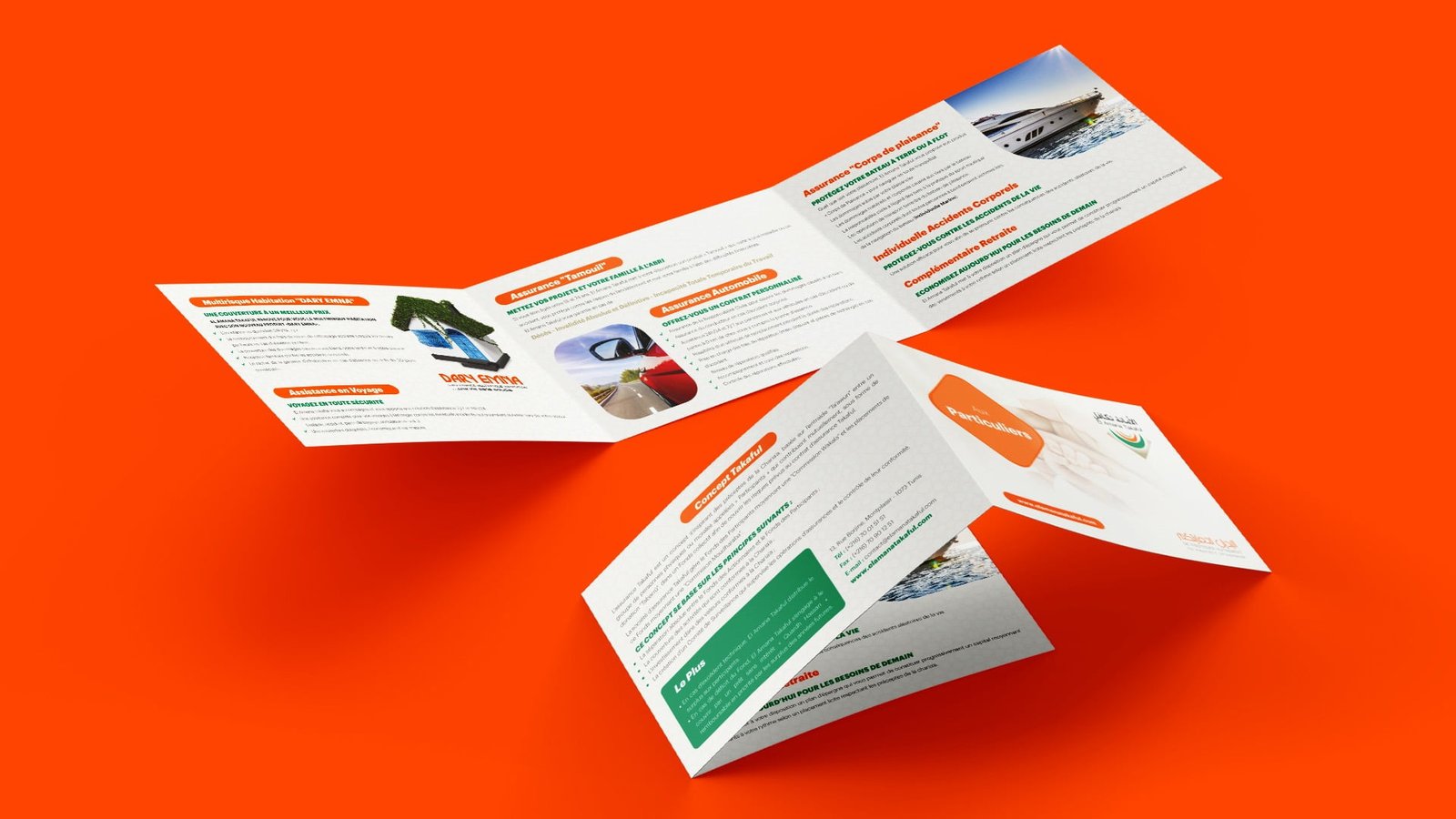
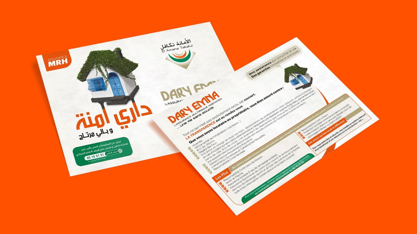
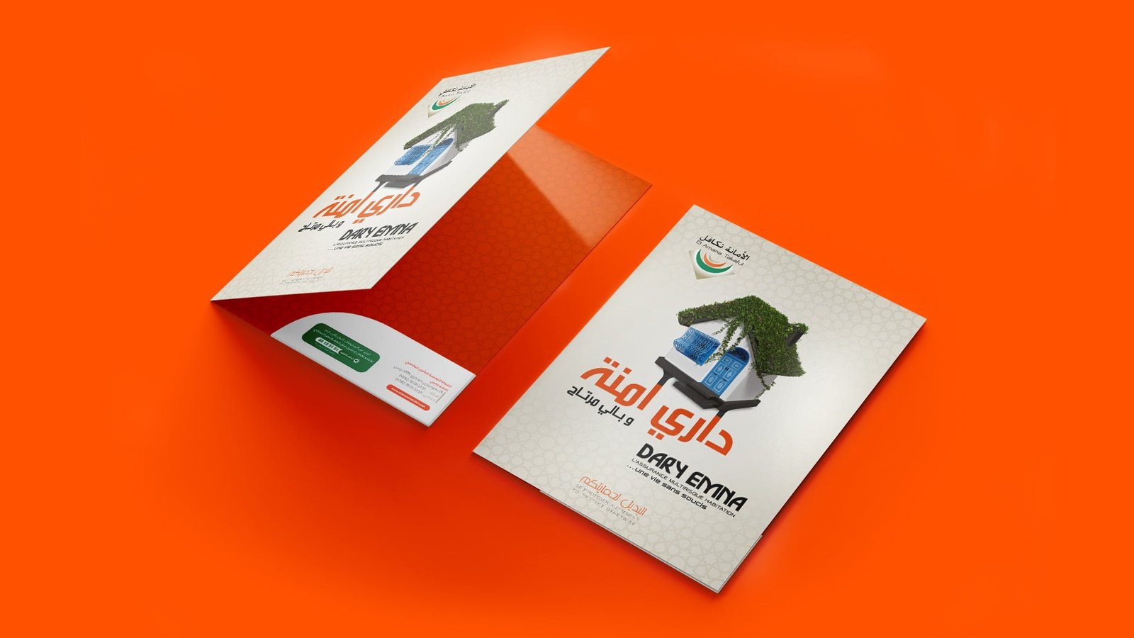
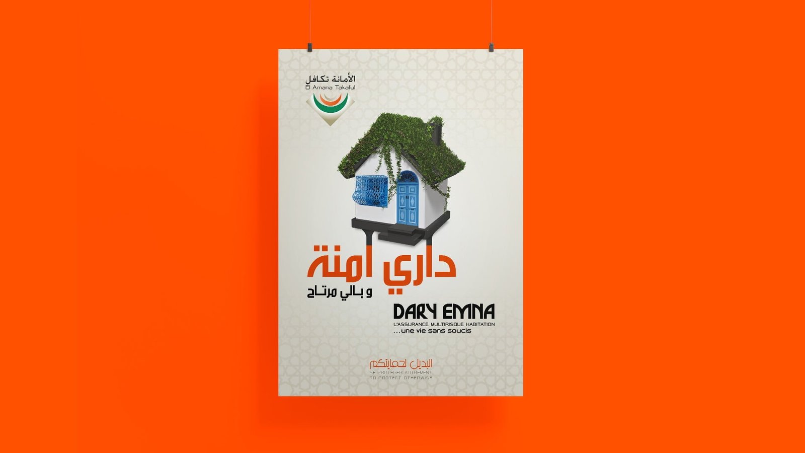
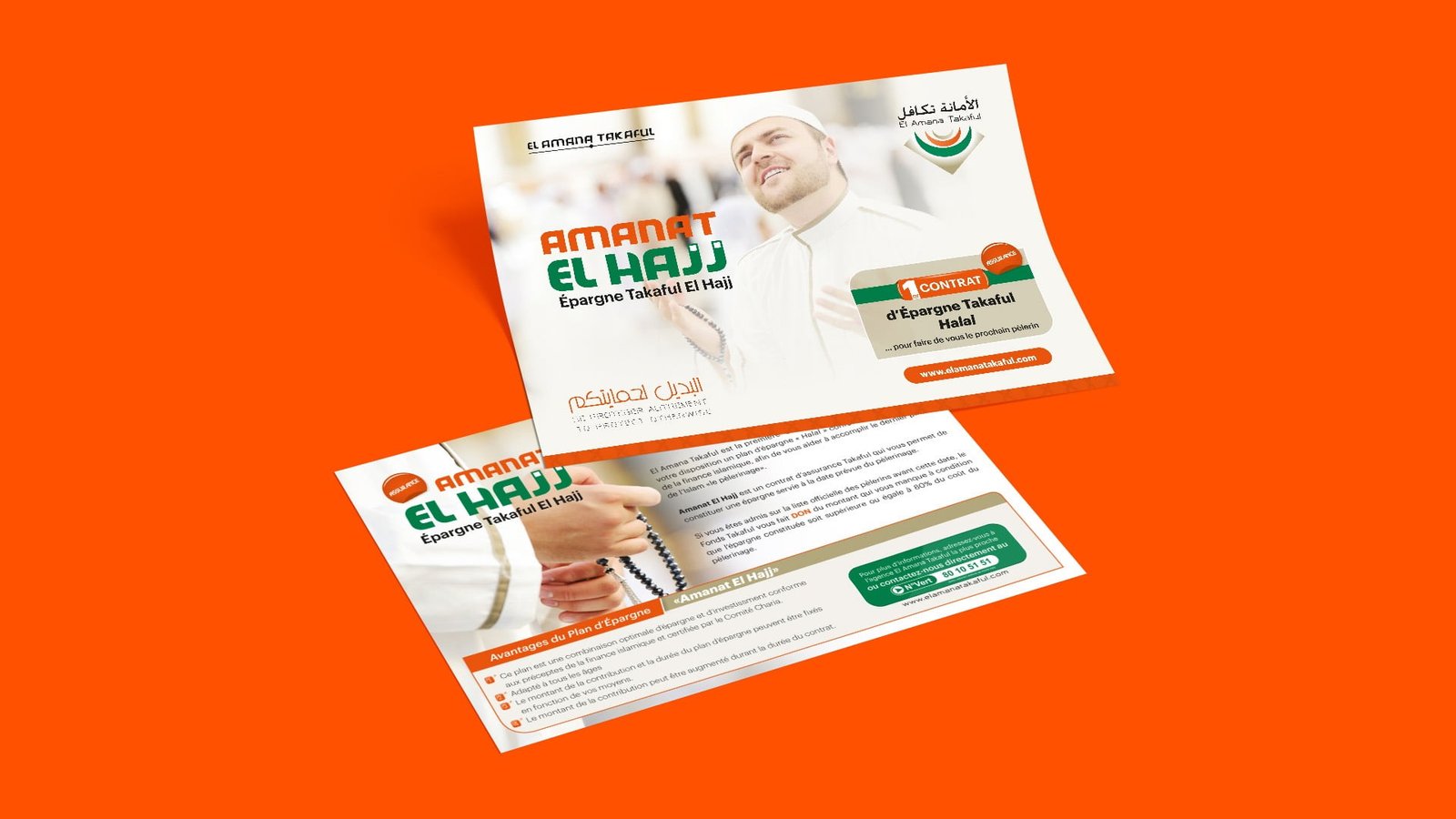
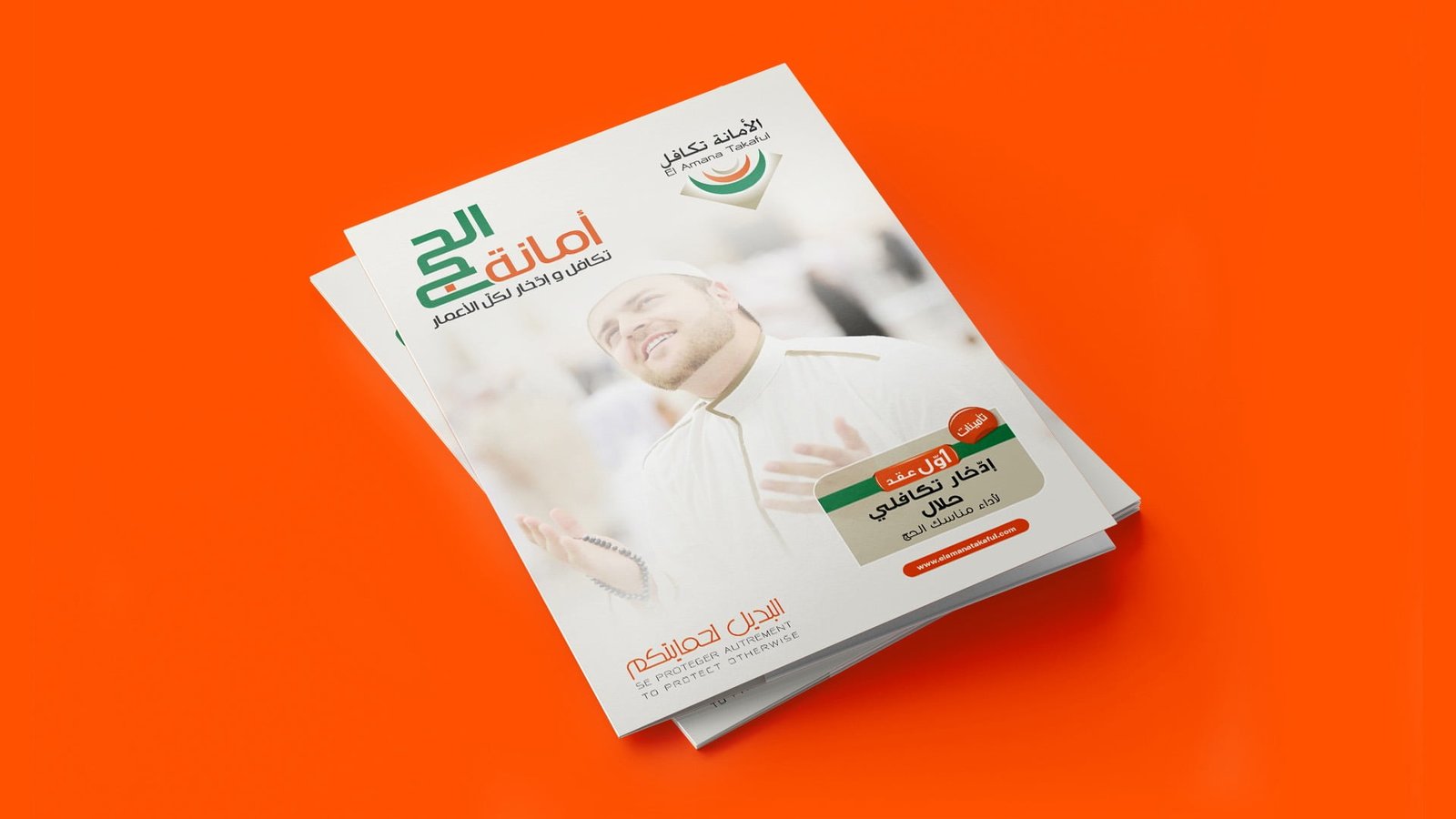
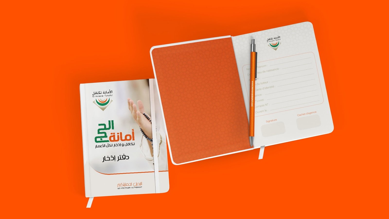
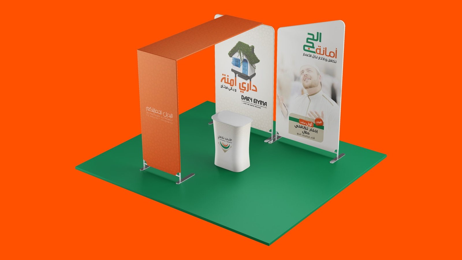
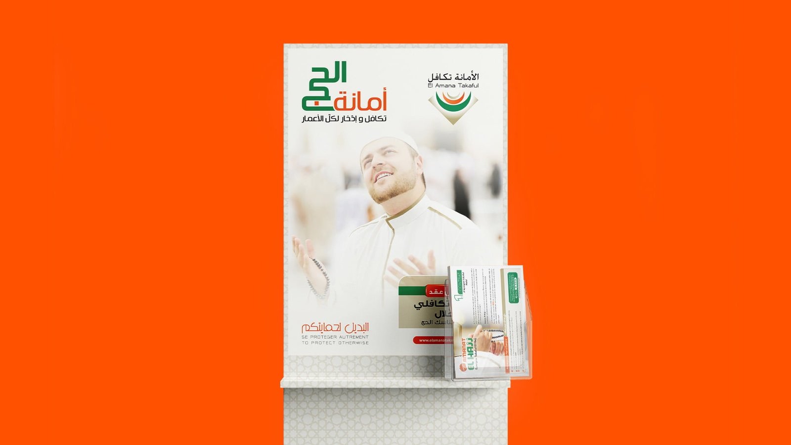
Ensuring Family
and Business Stability

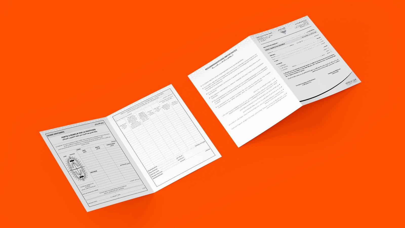
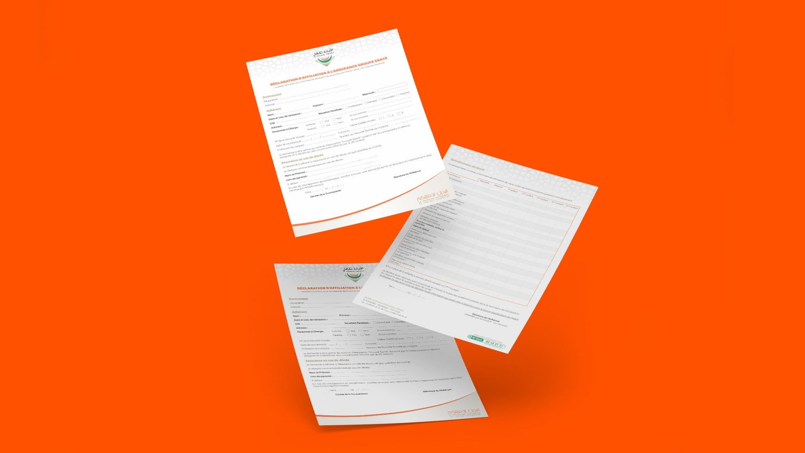
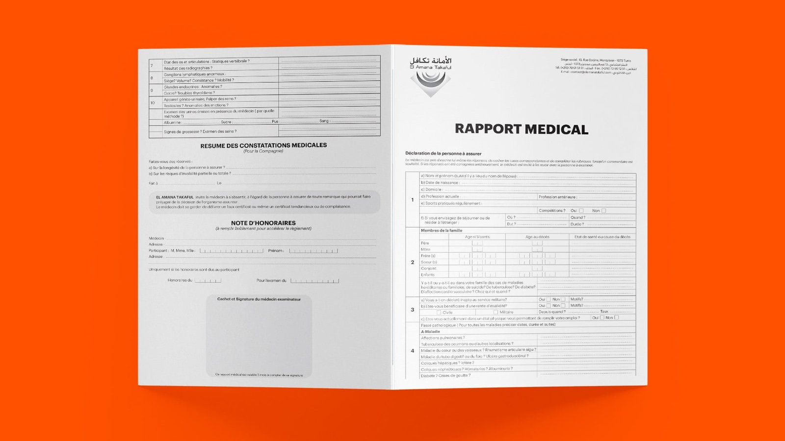
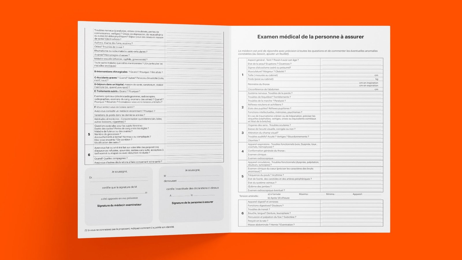
El Amana Takaful offers a full range of insurance products for individuals, professionals and businesses. Its dynamism, its efficiency and its asserted will to want to better meet the expectations of its customers constitute the fundamental qualities of the company which advocates above all the satisfaction and loyalty of its customers.

Projects

RESPONSIVE LOGO / GRID Sizes and Clear Spaces

Projects
Projects
Projects

Brand Colors

Projects
Projects
Projects
Projects
Projects
Projects
Projects
Projects
Projects
Projects
Projects
Projects
Projects
Projects
Projects
Projects
Projects
Projects
Projects
Projects
Projects
Projects
Sales Academy - UX/UI Design
Projects

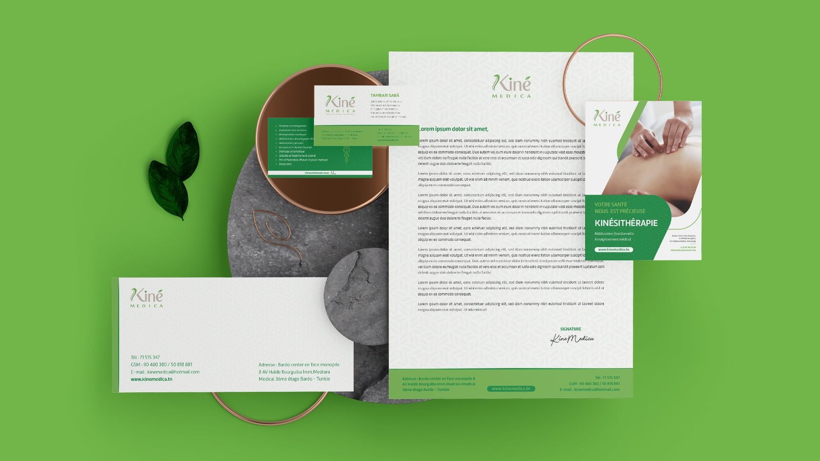
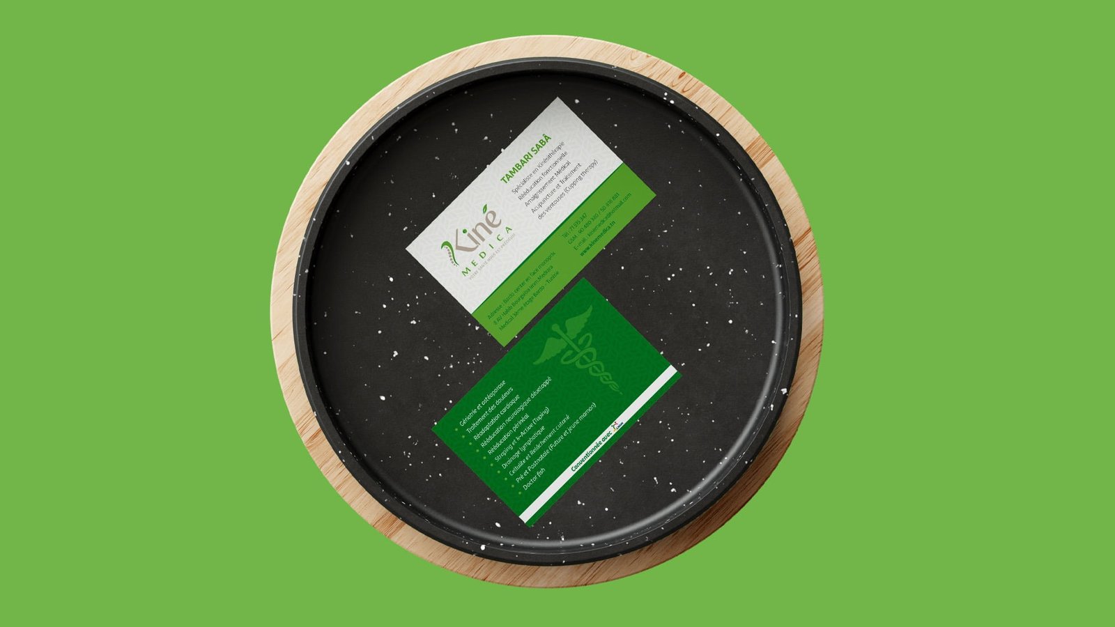
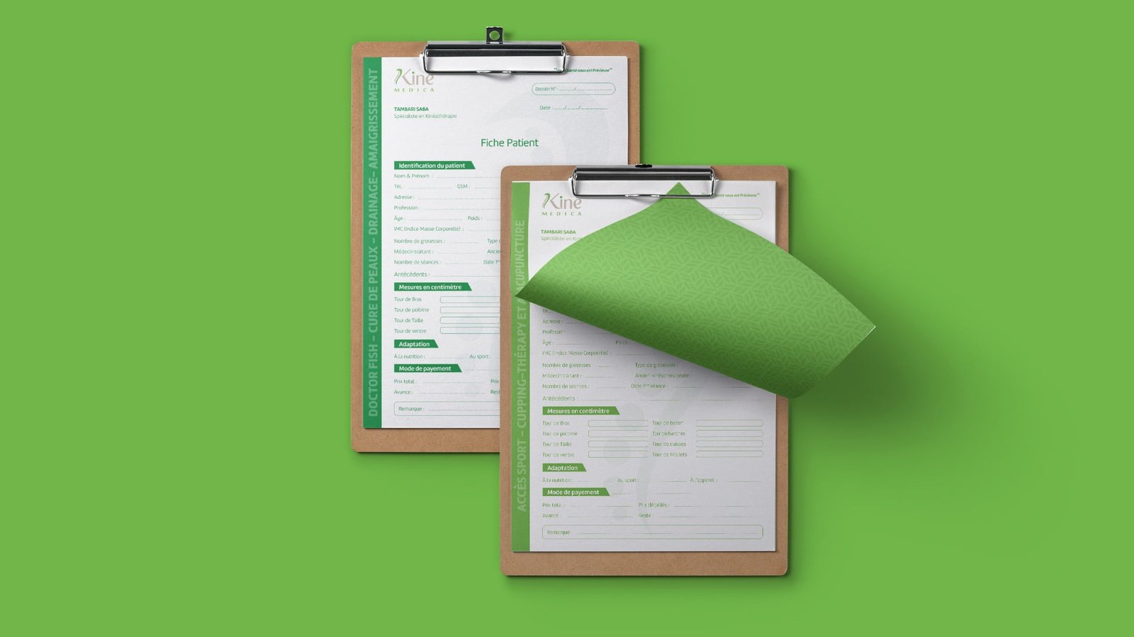
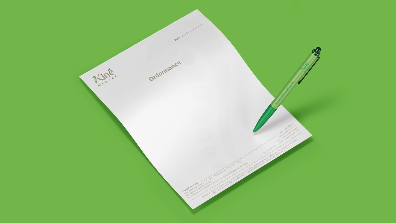
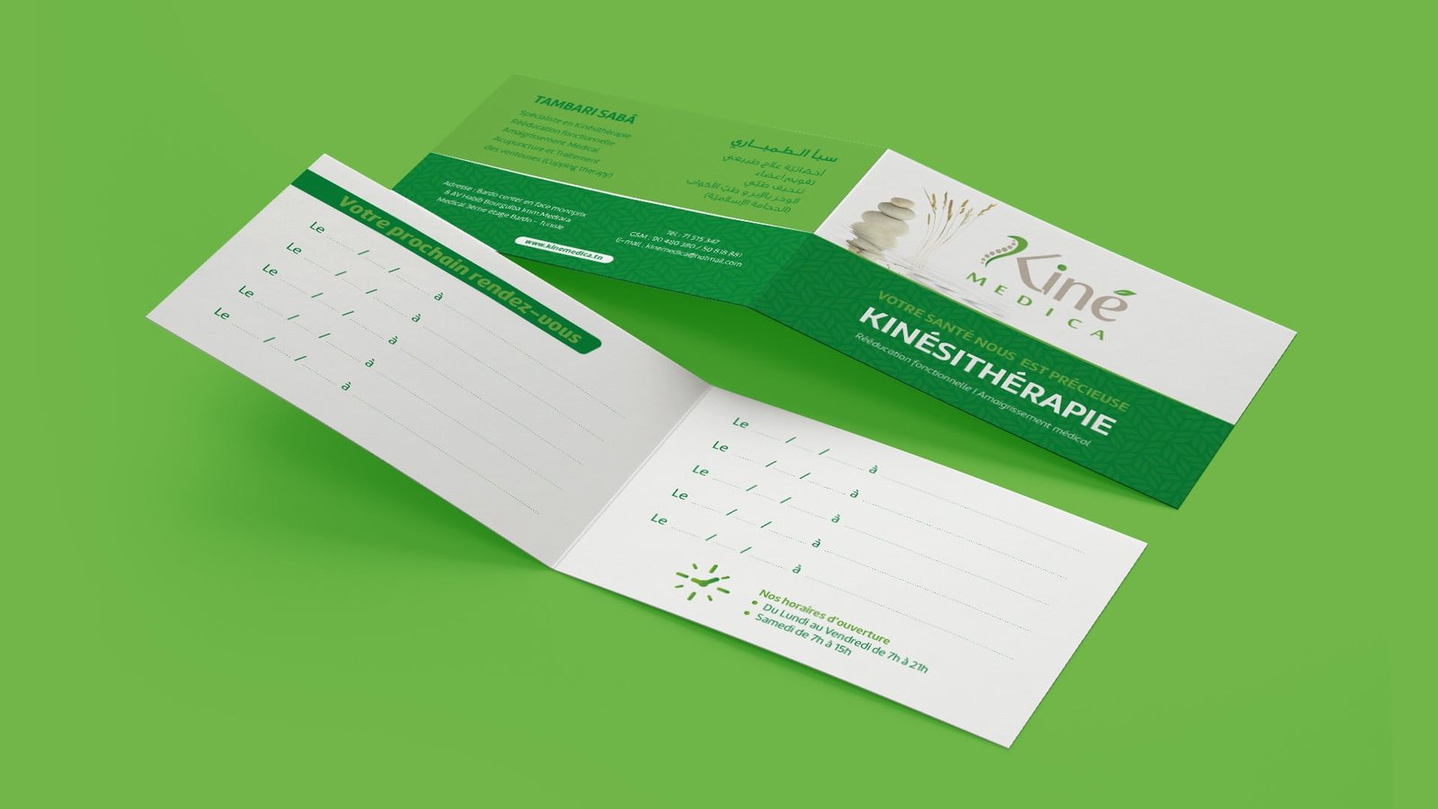
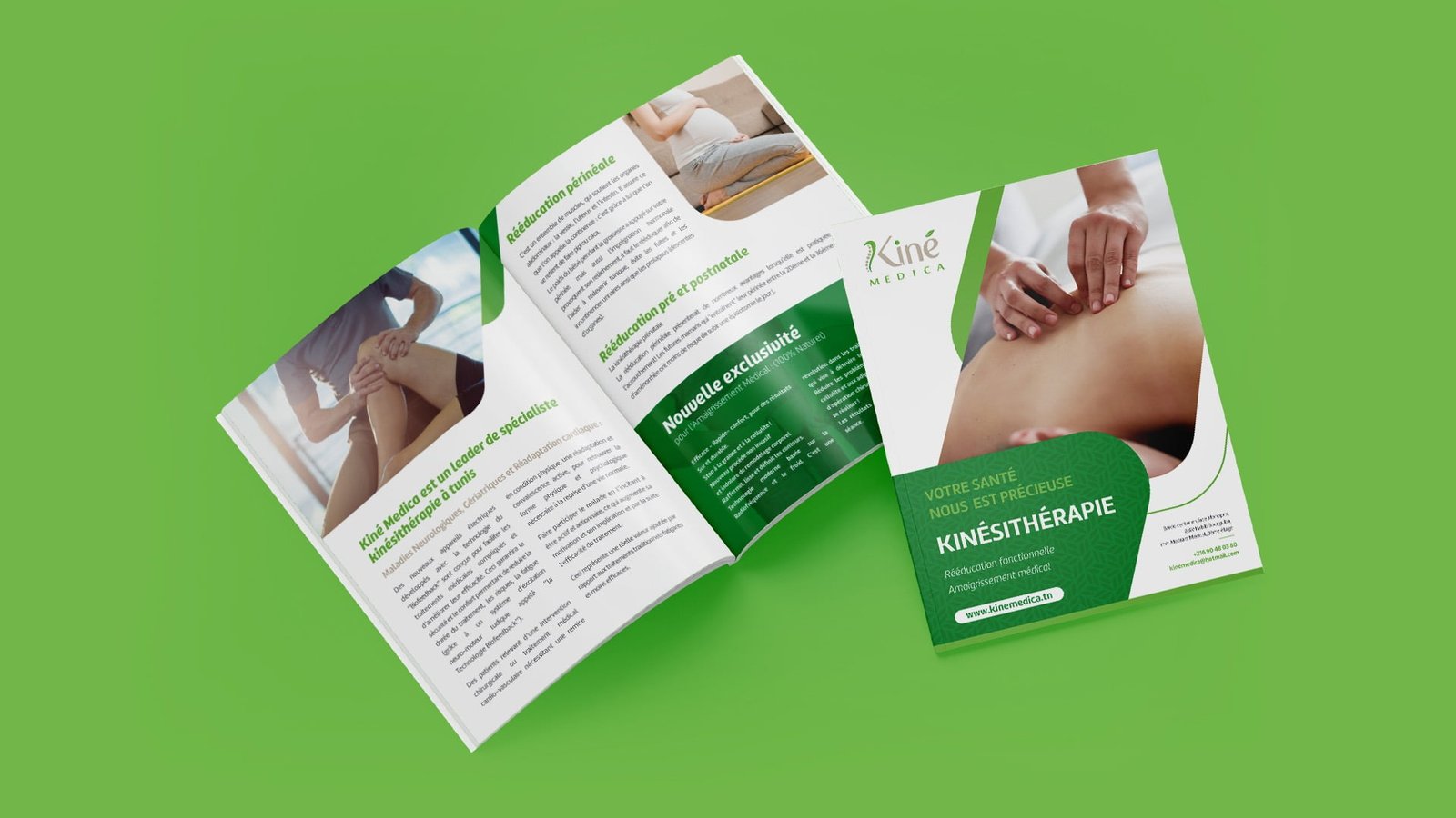
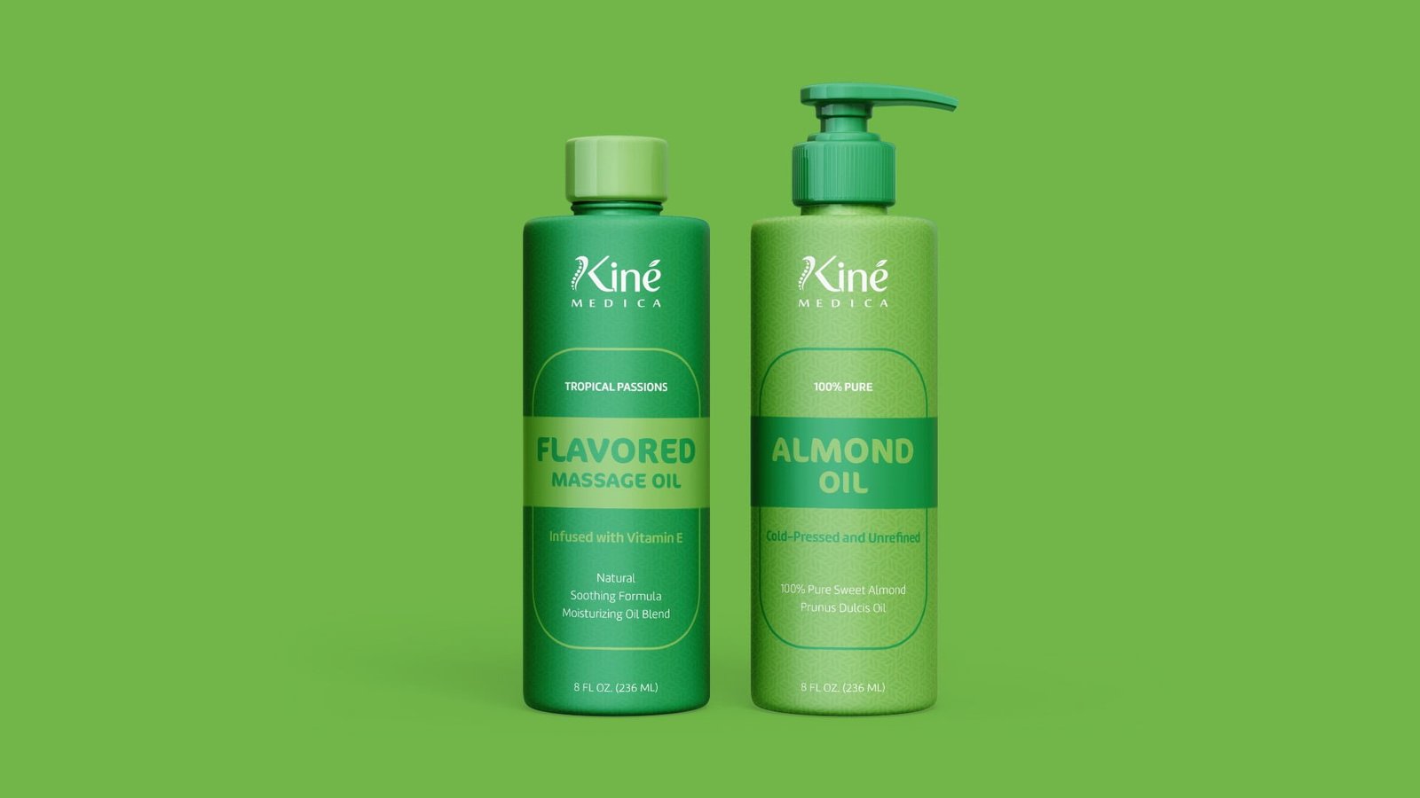
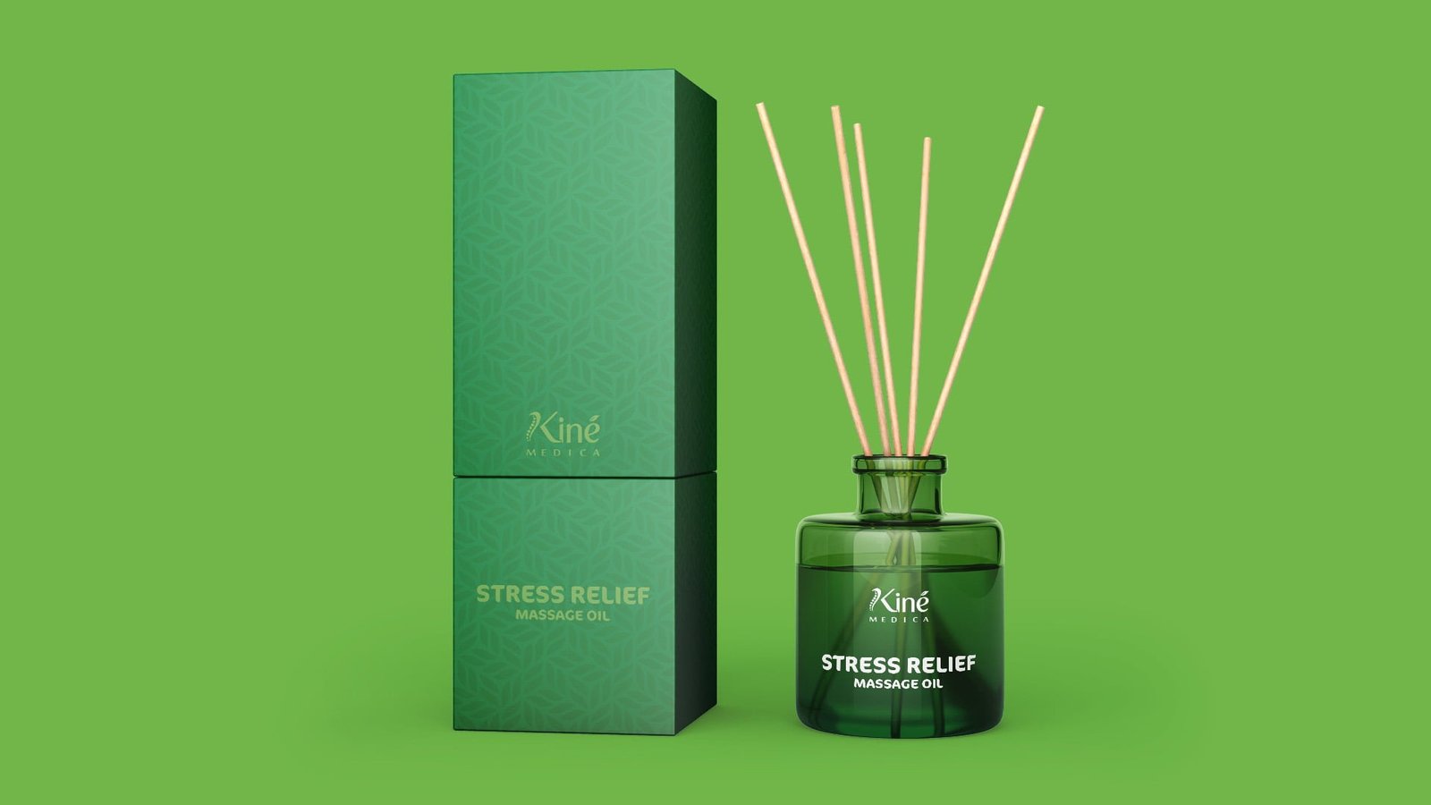
Improving people health,
wellbeing and quality of life

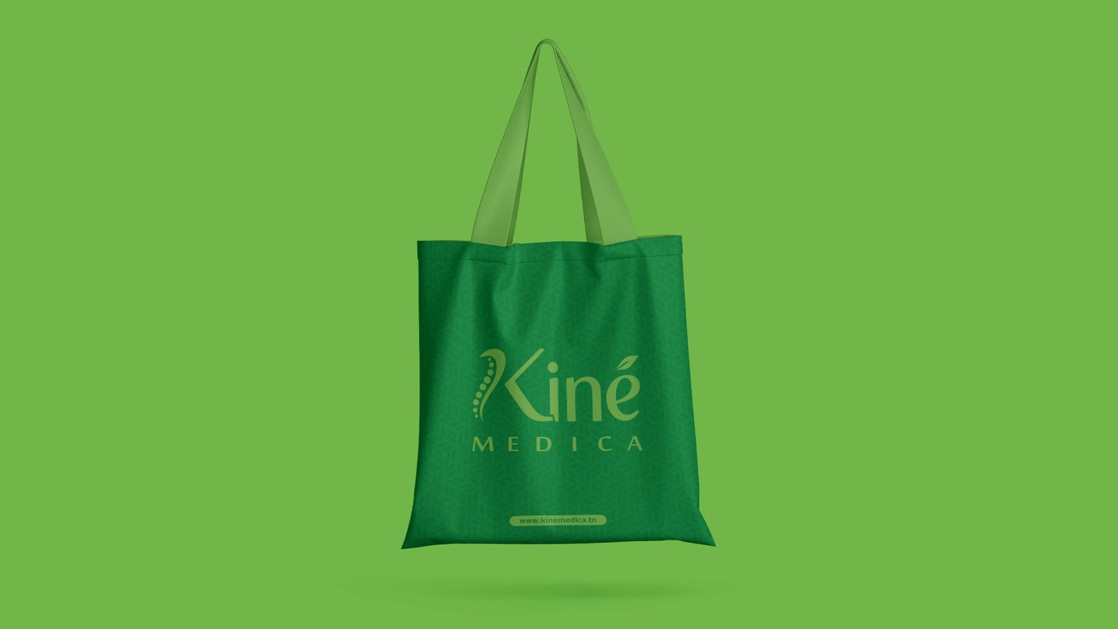
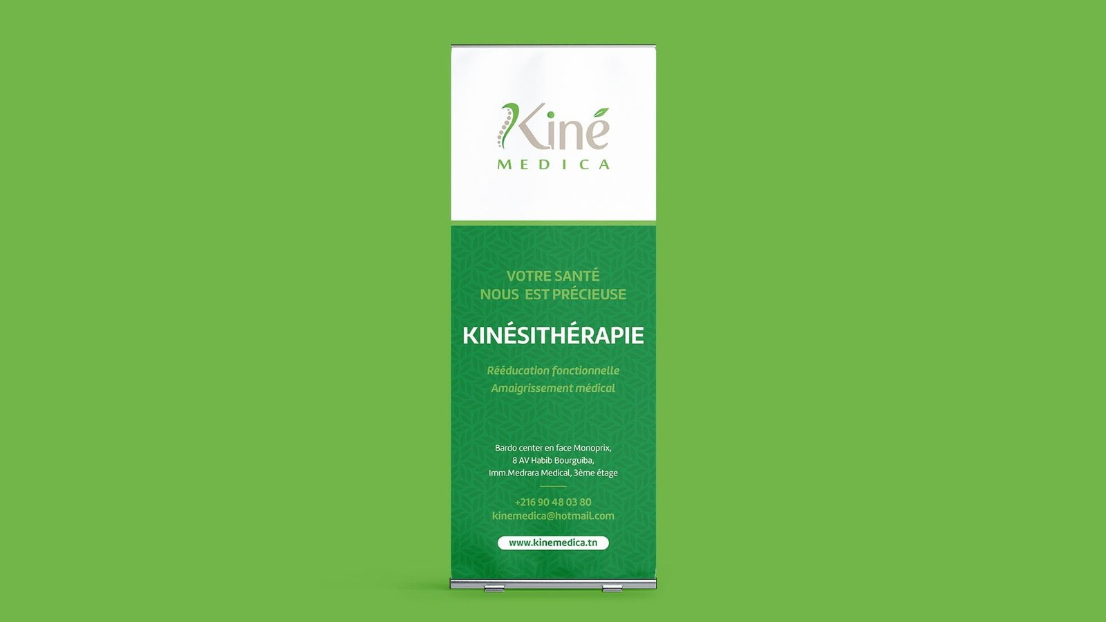
Kiné Medica is a physiotherapist who offers treatment and rehabilitation specialists in back and neck pain, joint problems, sports injuries and nerve impingement. Also specialize in running injuries, overuse injuries, repetitive strains, sciatica, work-related injuries, osteoarthritis, whiplash, postural problems and osteoporosis.

Projects

LOGO CONCEPT

Projects

RESPONSIVE LOGO / GRID Sizes and Clear Spaces

Projects
Projects

Use on different Background

Projects
Projects

Brand Colors

Projects

The GRADIENT

Projects
Projects
Projects
Projects
Projects
Projects
Projects
Projects
Projects
Projects
Projects
SBC - UX/UI Design

Open a Ticket

Create new Support Request

Our studio hunch Team is available 24 hours a day, 7 days a week. Send us your questions or comments by filling out the form below. You will receive a response within 24 hours.

Frequently asked questions

Questions we get often

We often get asked the same questions. We’ve put the most common in this section.

Studio Hunch will simplify your life and save you money over time due to our knowledge, experience and expertise in the industry. We keep up with current design and market trends, and help you arrive at the best solution for your business. We help you avoid the costly trial-and-error and unnecessary fees associated with creative projects due to our knowledge of the industry. Also, our experience in the field will enable us to create custom solutions according to your specific needs.
If you have a unique problem and are not sure what to do about it, talk to us! We love the challenge of creating unique solutions for our clients. Furthermore, we are happy to coordinate directly with printers, web hosting and domain companies, and other agencies – all so you can rest easy while we get the job done.
To get started with Studio hunch, select the service you wish to work with on our Services page and click Get Started. This will take you to a form that you can fill out and then submit. We have 35 Services to handle your creative needs but, if you can’t find something that fits, talk to one of our experts.
The purpose of our first meeting is to get to know you, your business and your goals. We want to know everything about your business, from why you got started in the first place, to what your current pain points are. From there, we get a better understanding of where you are coming from and what you hope to accomplish with the current project. If we are both interested in continuing the project, we will send you a proposal for the work to be completed, and a questionnaire about your business. We believe mutual communication and understanding are essential to not only a successful project, but a great ongoing relationship.
GOOD design, takes time. The logos we all love and see out there were the results of tons of research, craft, customized strategy, thousands of sketches and iterations. I don’t want to compromise the quality of the work or give you a design that I know could have been 10 times better. The quickest time frame to get your business equipped with the basics is estimated at 6 weeks.
Before inquiring about our design services, you can have a look at the case studies in Projects page and see if you like our design process & style. Moreover, before we book your project, we like to have a quick call to go over your thoughts and ideas for your new brand ! This allows both of us to see if we are a good match.
That depends entirely on the project! A complicated project can take months, while a simple one can be done in a matter of days. Our ability to complete a project also hinges largely on your response time. We rely on your feedback to create a great piece of work, so the sooner you respond to us, the faster we can move forward. We will be able to discuss a more concrete time frame during your consultation.
Although the majority of our clients collaborate with us on both brand & web design, it is not required to go through branding with Studio Hunch to build a website together – however we must review your current branding to ensure it is both comprehensive enough, as well as matching our aesthetic and standards.
During our consultation call we will discuss the project start date. This is affected by factors such as our availability, how prepared the content is (i.e. having photos, product, etc ready), as well as the readiness of the client to dedicate the time to the project. We take our timelines seriously and only work with clients who are, in turn, serious about their projects.
Although we find having content ready at the start of a project makes the entire process flow much more smoothly, we understand sometimes it’s not always possible to have all your content ready by the start date. This is something we can discuss during our consultation call and discuss solutions for via stock photos, referrals, in house photography and/or copywriting & more – although these extras are not automatically included in our packages. Not having content ready to go extends the timeline of the project quite a bit.
We use Wordpress, Elementor pro and Woocommerce to build our clients  websites. During our consultation call we will discuss your needs and recommend which is best suited for you and the longevity of your business.
Yes, we do require professional photos for all of our web projects. Why? We could design the most beautiful website in the world, but if the photos on that website were of poor quality and unappealing, the website would fail to convert clients and serve its purpose. We take our clients investment in design seriously – if we’re going to do this, let’s do it right. We offer brand & product photography, or can recommend photographers across the country as well.
Clients are responsible for providing professional photos, all finalized copy/text, and all product/package information in a neat and organized manner. Although we provide content workbooks and designs to make the process as simple as possible, photography and content writing is not included in our packages. We do offer these services and find it makes the process smoother for both our clients and ourselves when everything is done in house. At minimum the first draft of your copy must be provided by the project start date.
Of course! We are happy to coordinate with your chosen partners to complete a project. However, please keep in mind that you will be responsible for handling print issues, billing and delivery schedules once we have completed our portion of the project.
As every project is incredibly unique, we do not force clients into pre-made packages, but instead custom price and scope each project to ensure clients are not paying for items that are unnecessary, and that any needs are not left out. Custom proposals are created and sent to the client within 48 hours of our complimentary consultation call. All projects are have completely custom solutions that offer the most value to your brand in order to achieve your goals. We craft each project for success on its own terms.
Quality, strategic design is an investment, and we understand how much can go into getting a business started. We are happy to offer flexible payment options based on date (not project milestones). All projects require a minimum 30% deposit to book regardless of the selected payment option, and we do not offer payment upon completion.
 
No, our fees are based on how much work will be involved in creating a great product for you. Since we are not willing to compromise on the quality of our work, we also cannot negotiate on our rates. However, if your budget is constrained, we can reduce the scope of the project, or break it down into phases.
There are 2 ways we can continue to work together:
Retainer: We can arrange a certain number of hours per week or month, or we can create a task-based schedule, depending on your exact needs.
Hourly: If your brand support needs aren’t systematic yet, We’re happy to work on an hourly basis

Share your Feedback

Help us improve

At Studio Hunch our goal is to provide the best Custom Design Experience. We would love to hear from our clients to see how we’ve been doing. Your feedback will be much appreciated.

This website uses cookies

We inform you that this site uses own, technical and third parties cookies to make sure our web page is user-friendly and to guarantee a high functionality of the webpage. By continuing to browse this website, you declare to accept the use of cookies (Privacy Policy).